two squares, many arches

PORTICO-HOUSE_10

It’s been far too long – apologies are in order.

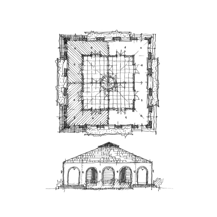
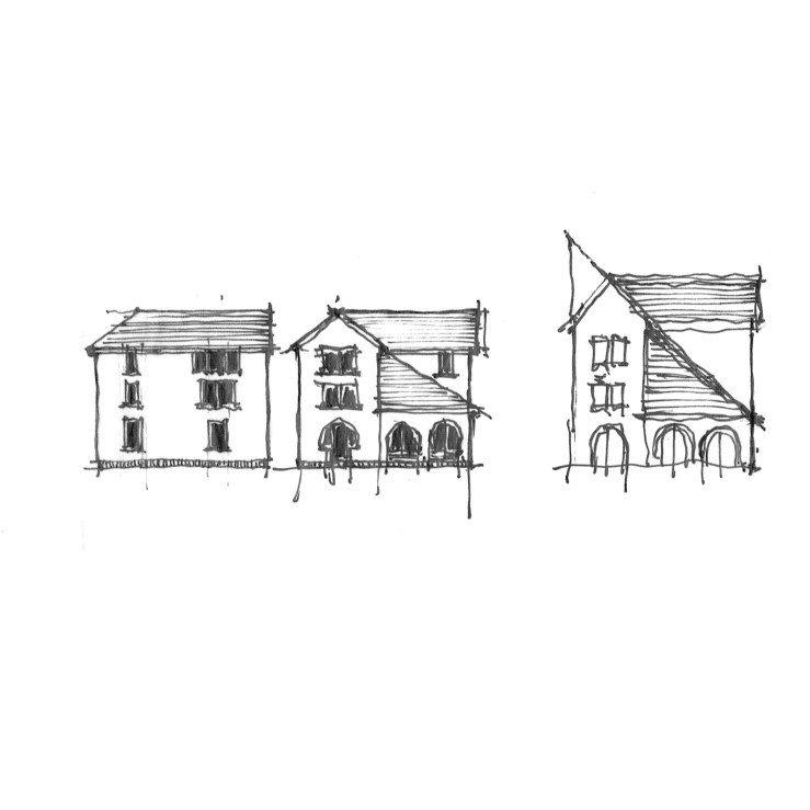
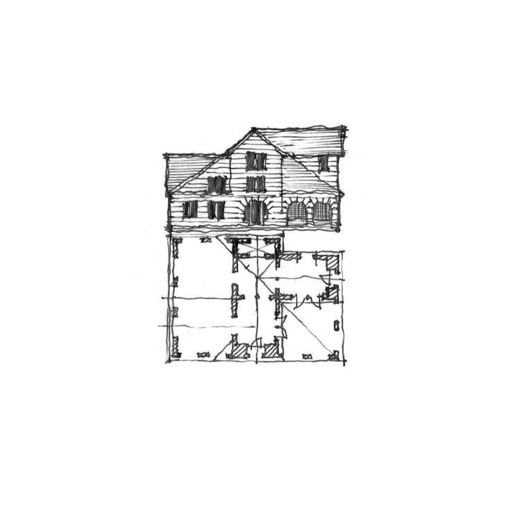
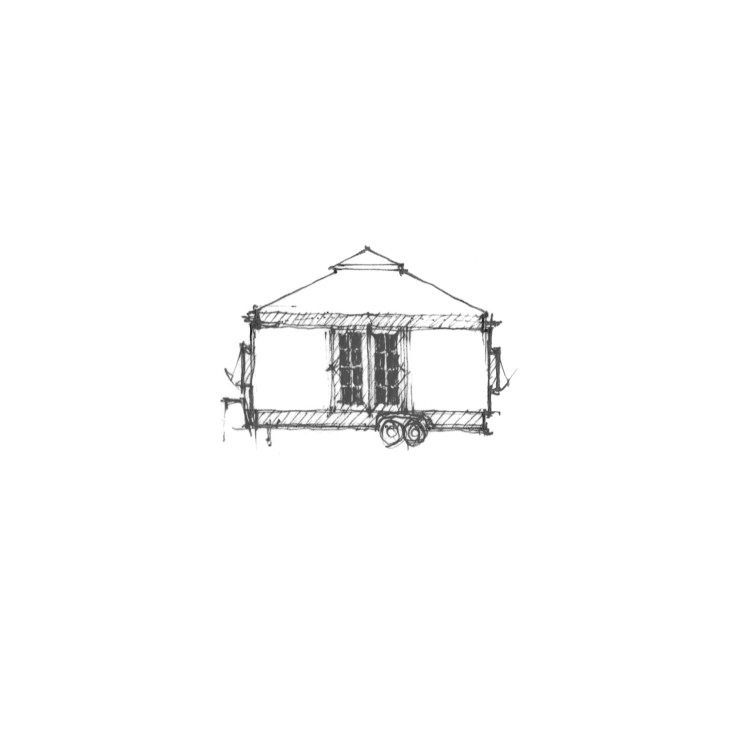
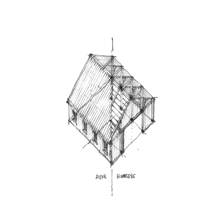
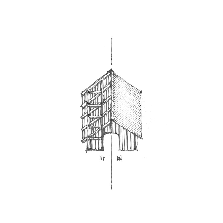
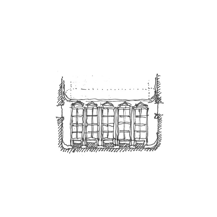
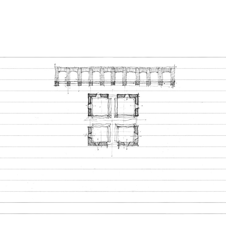
But today it’s back to basics: square and arches.  The first project is a simple study of a simple idea, instigated by an awful homespun diy renovation in my neighborhood, where a series of plaster arches had been tacked up under a shallow roof overhang, obscuring the clapboard home beneath.  I’ve ordered it a bit more, rendered in a square with access via brick steps at the corners – a four square clapboard home sheltered behind a humanist arcade.

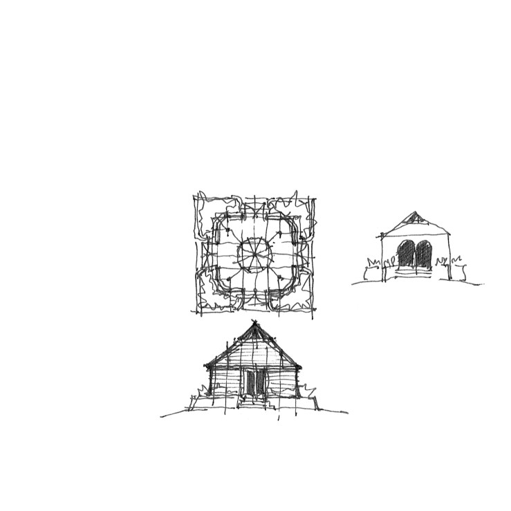
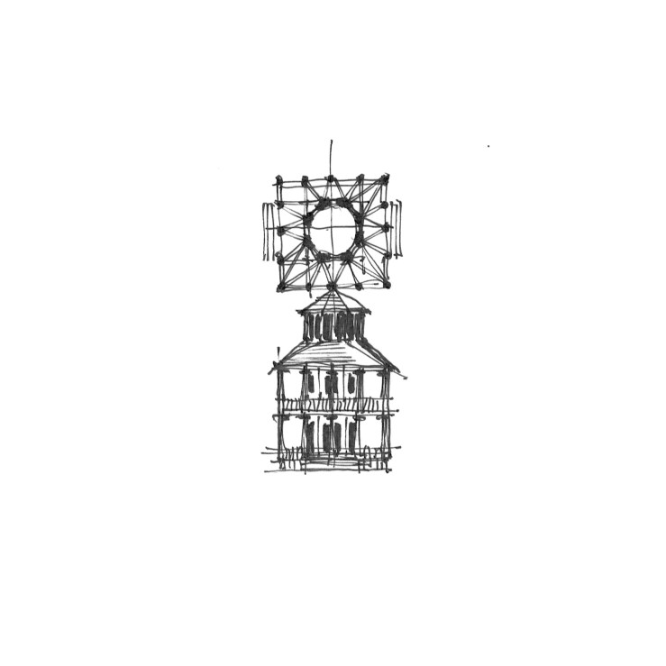
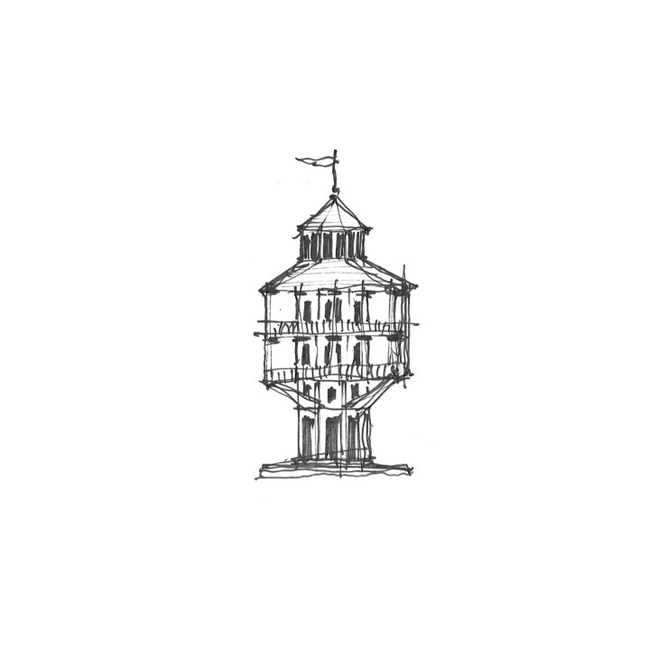
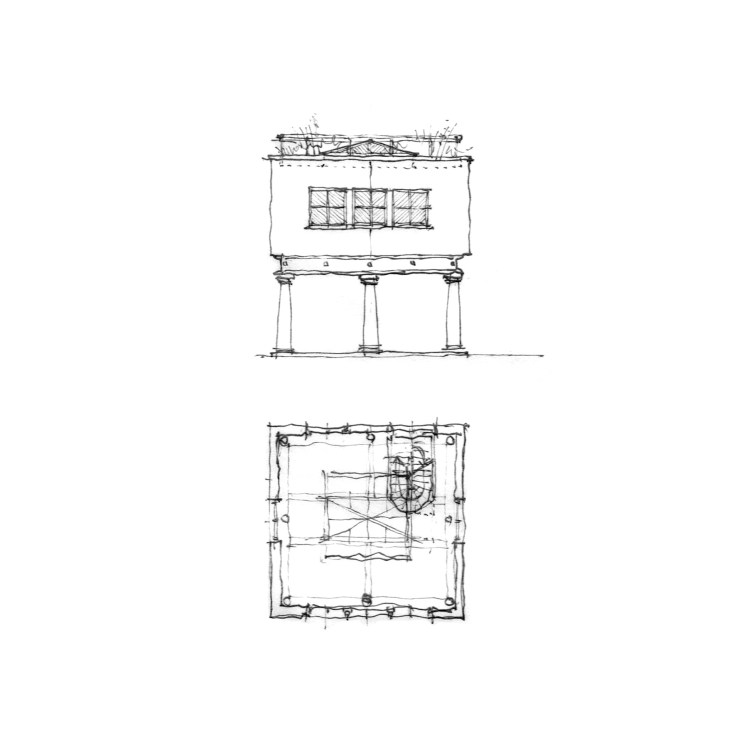
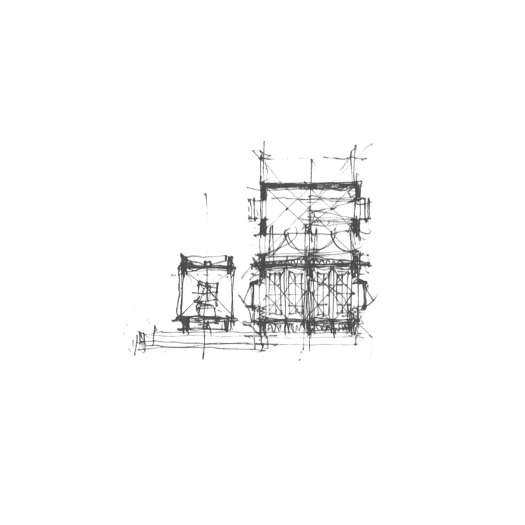
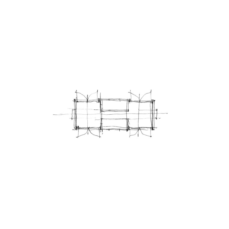
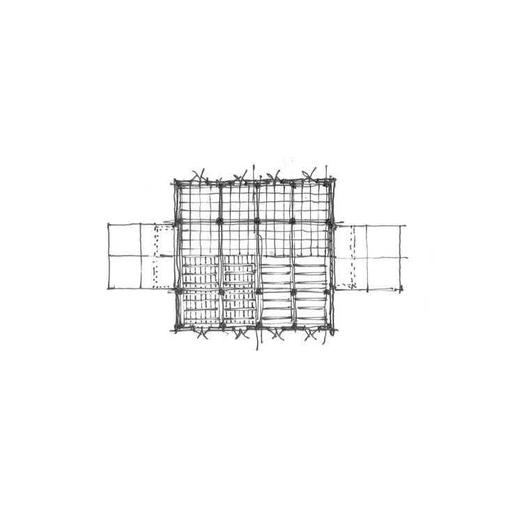
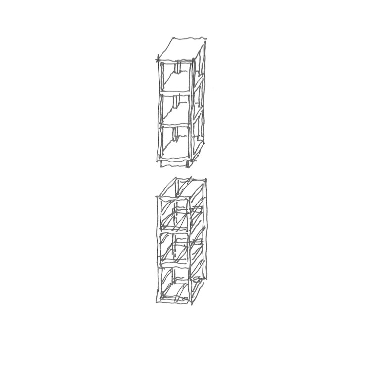
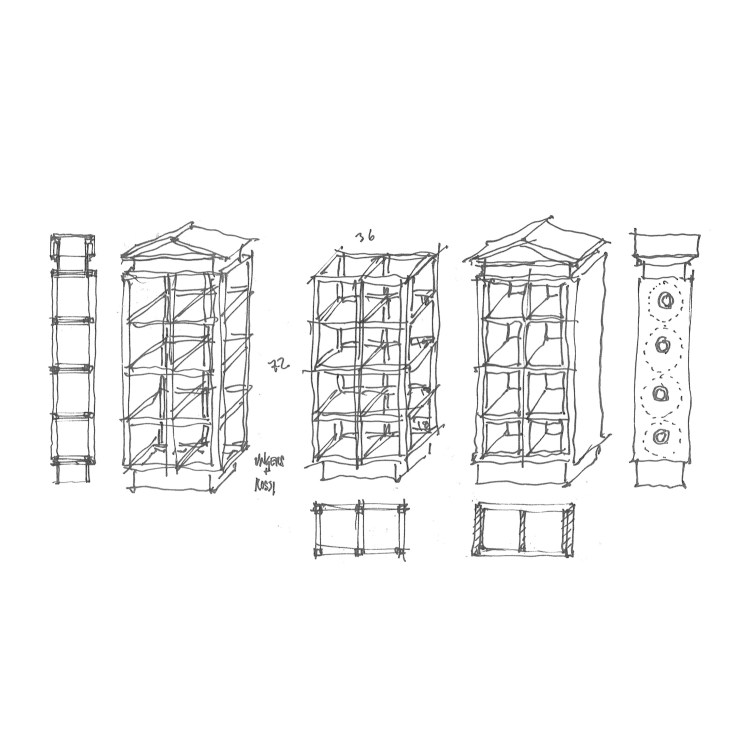
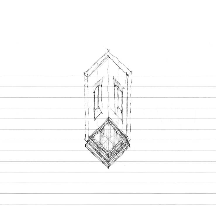
The second project is another simple pavilion, this time with rounded corners and  centralized access.  A quick study to the right explores an arcuated form, with a centralized column instead, harkening back to the four square plan mentioned above.

PAVILION_18

a skylit studio

VILLA_11

After taking a little well-needed vacation, I’m back with more frame.  Specifically, I’m sharing a continuation of the past two posts – a hillside studio and home.  Both of these projects included a small cubic volume topped with a pyramidal skylight.  This particular ‘studio’ typology is explored more fully here.  While the exterior is a solid white stucco-ed cube, the interior shows a four-square heavy timber frame, with a pair of wood scissor trusses forming a smaller cube at the top, which is itself topped by the skylight proper.  Since the geometry is a bit difficult to make out in these projections, I’ll draft up a quick perspective for a subsequent post.

VILLA_12

VILLA_13

VILLA_14


wrap-around-the-octagon

TOWER_03

I find the late Victorian octagon houses fascinating on many levels (this one, this one, this one).  A few weeks back, while scouring a site devoted solely to documenting these gems, I stumbled upon one that had been wrapped in a square two-story porch.  This project is a derivative of that, with a tower-like octagonal form completely subsumed behind the square porch, only peeking out in a cupola at the roofline, taking a cue here or there from good ol’ Aldo Rossi. A study below takes the tower metaphor further, extending the octagon below the porches, which take on a more expressive tectonic with braced timber supports below.

TOWER_04

L’s and porches

DIAGONAL-HOUSE_01

This small house takes its initial generation from a small, L-shaped home I drove past while on vacation in Oregon this past spring, where a porch filled out the square floor plan, its tall hip roof hitting the crotch of the two-story behind.  My version envisions a three-story volume to heighten the drama of the hip roof over the porch, with a circular stair at the corner of the L, while large Richardsonian Syrian arches front each gabled end, here rendered with a Gill-inspired symplicity.  I also toyed with adding a wing outside the L, after seeing a photo of a similarly planned house which featured a few wing additions – in this parti, the L is subsumed into an overall symmetry.

DIAGONAL-HOUSE_02

DIAGONAL-HOUSE_03

DIAGONAL-HOUSE_04

the five points, revisited

FIVE-POINTS_01

Leon Krier always has an interesting point or two to make with regards to Le Corbusier, most likely due to Corb’s immense power over Krier’s earliest work and schooling.  In many ways, Krier’s career can be seen as one long extended dialogue with (and often against) the Modernist figurehead.  As part of that, Krier has recently talked about a resurgence of those five points against which Corb wrote his – and argued that these five points ought to form the core of a vernacular traditionalism, much in the same way Corb’s have loomed over the moderns.

So I figured I’d take a synthetic middle ground.  What happens if we take Corb’s five points and dress them up in traditional garb.  What then?  Piloti are given bases and capitals (and become columns); picture windows are gathered into long fenetre en longueur; the plan is libre (free of rooms en filade); the roof is flattened to host a garden; and the only point I’m probably missing is the free facade.  O well, better luck next time. . .

FIVE-POINTS_02

teenie. tiny. home.

TINY_01

Or is it just glorified trailer?  Oh, let’s not quibble over semantics, shall we?  You’re here for pretty pictures.  Well, what I have here is a small ‘home’, a tiny home, rather.

There is a whole market out there that is centered around this new class of detached homes for those without the budget for a conventional suburban home, or those who would seek to lessen their actual footprint on the earth in addition to their carbon footprint.  What I find interesting is the challenge of fitting all the normal homey things into a smaller package, wrapping that package around conventional building modules, and yet still fitting it into Department of Transportation standards for a ‘mobile’ trailer.

My thoughts ramble between two or three eight-foot cubes, all topped with pyramidal roofs and skylights, and jam-packed with foldable shelving, hidden beds, and all the other hoopla that comes with a ‘tiny home’.

TINY_04TINY_02TINY_03TINY_05TINY_06TINY_07

coffee church

COFFEE_01

Sitting in a local coffee shop, I began to wonder the great ‘what if’, and sketched out how I would have solved the problem.  Starting with a square (shocker), I drew out a central nave, complete with side aisles and a high altar – a wall of single origin small batch coffees complete with a cash wrap.  Sculptural skylights cut into the ‘nave’, while exposed lamps hang along the bottom of the ‘aisle’ soffits, not unlike old theatre marquees.  Grab a cup.  Stay awhile.  Amen.

barns, squares, & halves

BARN_14

Today, a barn, a square, and some fun with drawing projections.  If you’ve spent any time looking at my posts, you’ll know that I have a penchant for vernacular architectures, especially the banal agricultural buildings that dot the majority of America’s varied landscapes.  The barn is probably the epitome of those forms, and heavy timber framed barns seem to more or less rise from the earth itself.

This particular barn is my interpretation of the timber framed variety, with my love of formal rigor – the square.  The plan is a large four-square frame, with a double-wide central ‘nave’ and two single-wide ‘aisles’.  Large, folding doors frame the ends, with small punched windows the sides.  Since this barn is not intended to be utilitarian, the flooring is gridded black basalt pavers, with two large concrete decks on either end.

The drawings are all halves – the plan is half floor plan, half roof plan; the axonometric is half aerial, half wormseye; the oblique axon is also half & half; the elevation is half the side, half the front.

BARN_12

BARN_11

BARN_13

it started with a frame

CABINET_03

Rather, they started with a frame.  Shelves, that is.  I was scouring the internet and architecture books for shelves, first to house my inordinately large (and growing) library, and then just for the interest of how shelving could be used/designed in an architectural setting.  So I started with a frame, three cubes stacked, but quickly found myself drawn to a two-by-four stack, with it’s squares within squares.  Squares led me to think of Ungers, but placing a base and a top on it made me think Rossi.  The detail below assumes a hollow metal frame with sheet metal pediment and base, prefabricated coves cut and welded to form rudimentary mouldings.  A wormseye axon explores how an entire wall may be covered with these.  And a final alternate places two large half-round cabinets to either side of the shelving proper, taken from a large wardrobe Lutyens designed for Viceroy’s House, Delhi.

CABINET_01

CABINET_04

CABINET_05

CABINET_02

sets, bricks, jacks, and squares

SET_02

From Donald Judd and the architecture of art last week, I bring another tangentially architectural enterprise today: set design.  This work came about through viewing terribly underwhelming sets at the local opera.  My thoughts began to race about how the story could have been more magnificently communicated through architectural form rather than a few gauzy curtains.  This version positions a continuous brick jack arcade along the entire upstage, with four brick ‘el’s that could move about in the foreground, turning towards the audience for an ‘interior’ perspective, or away for the ‘exterior’, or alternated in-and-out, aligned into two open ‘rooms’, or one closed off cube.  Allusions to the work of Edward Gordon Craig, Adolphe Appia, and Richard Peduzzi abound.

SET_01