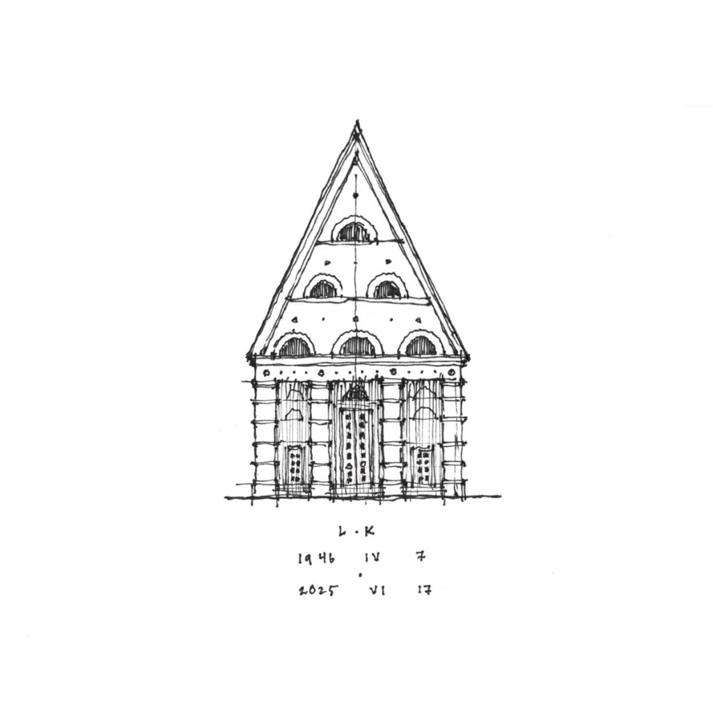
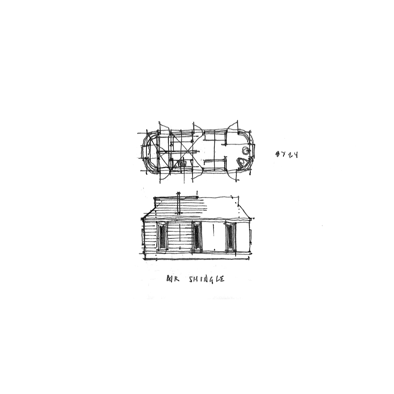
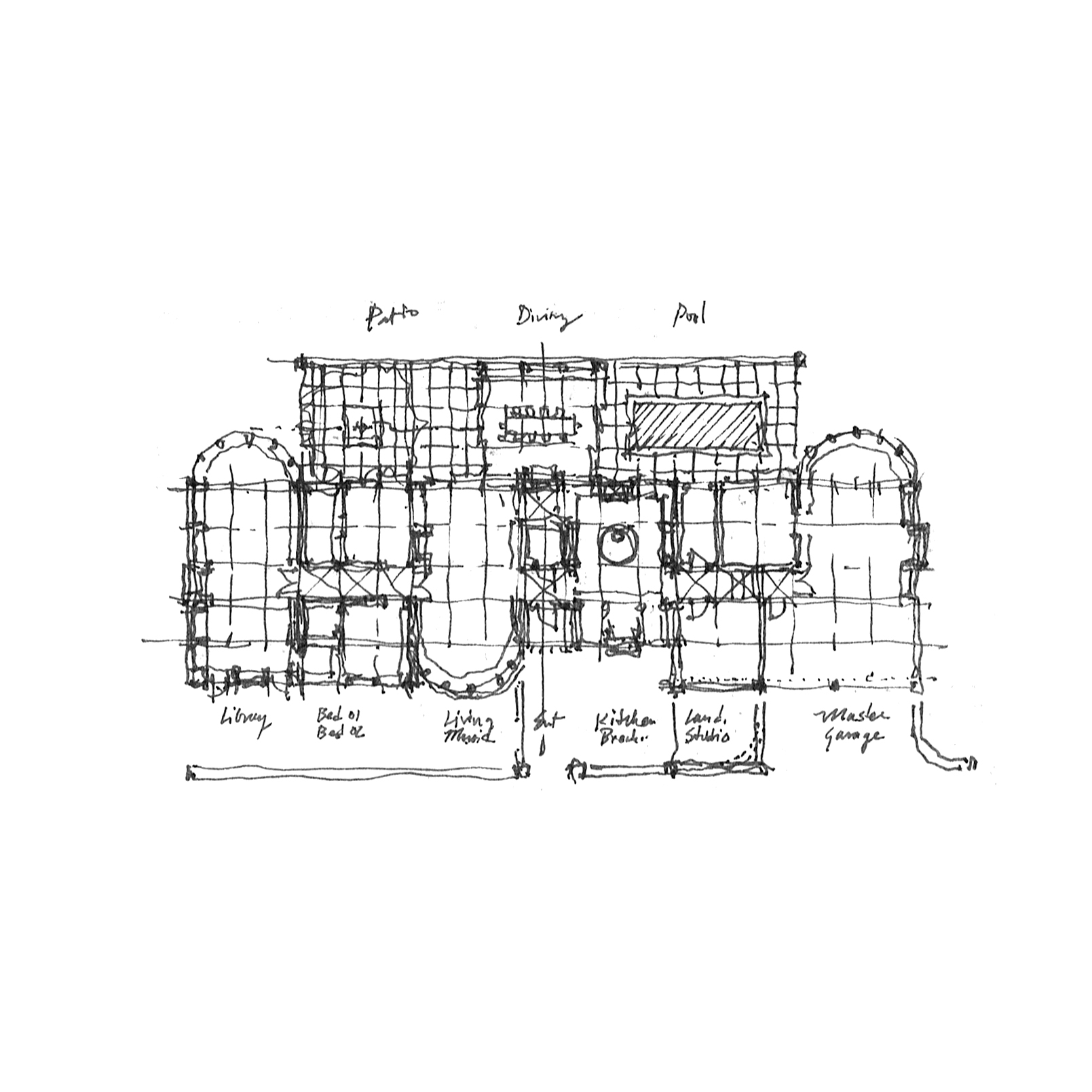
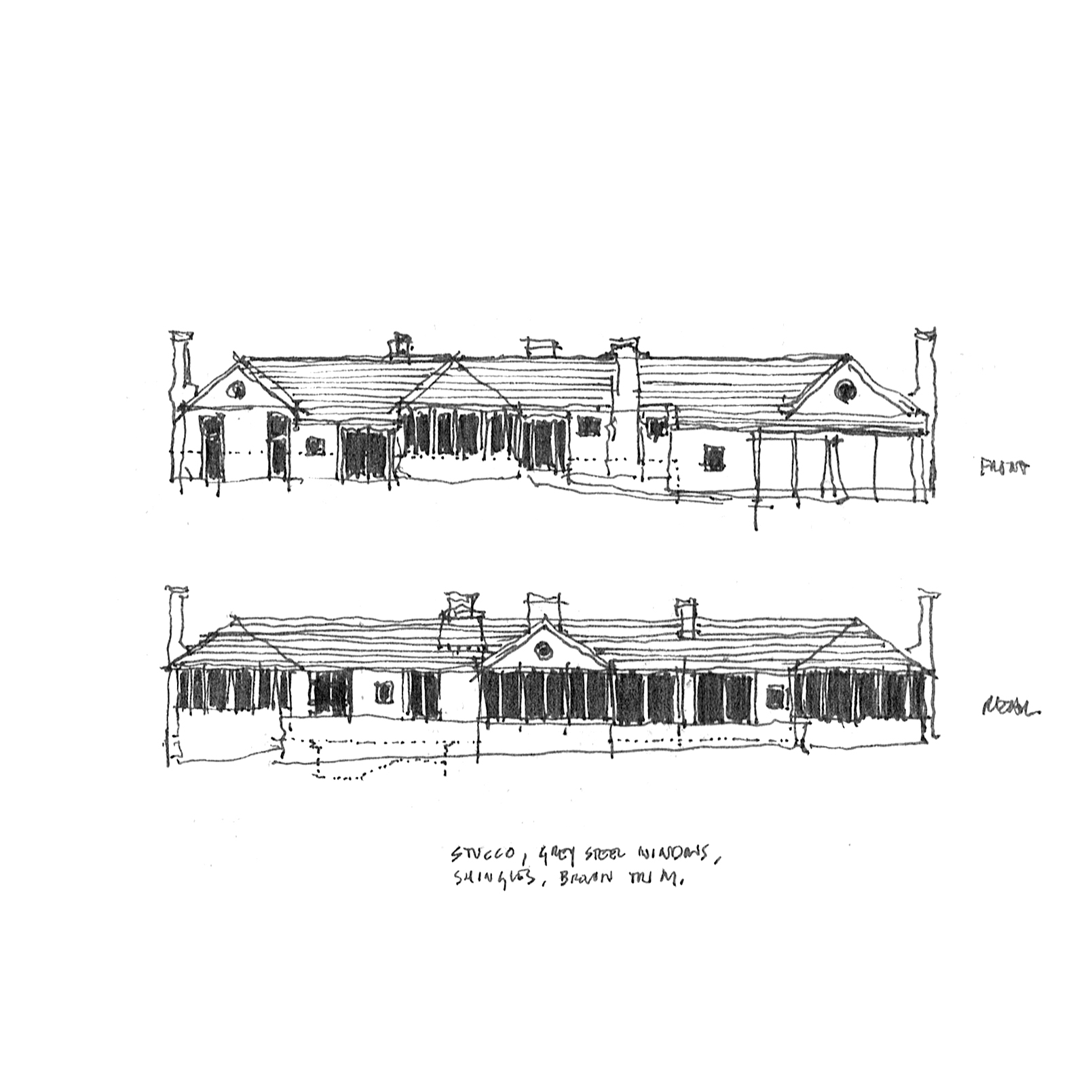
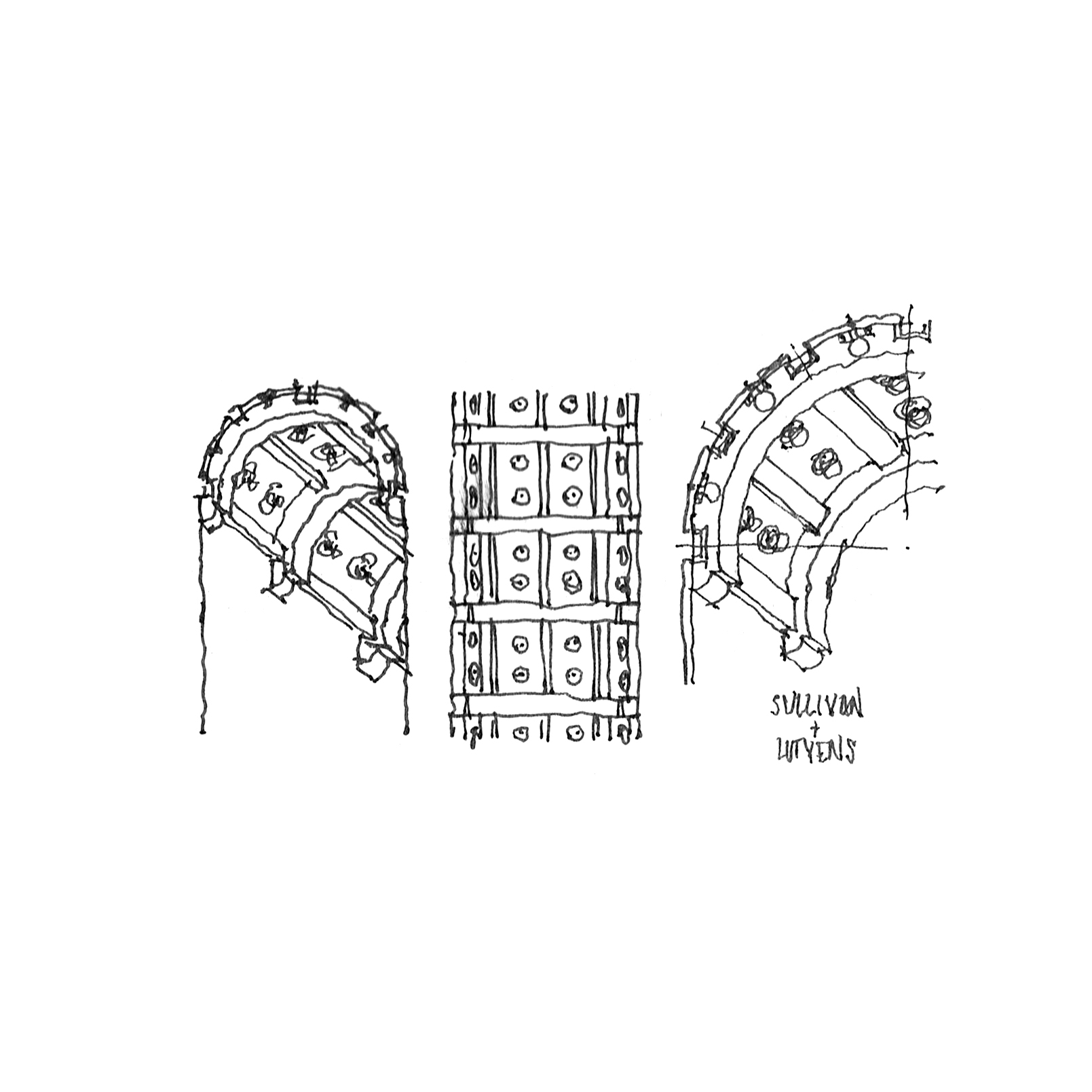
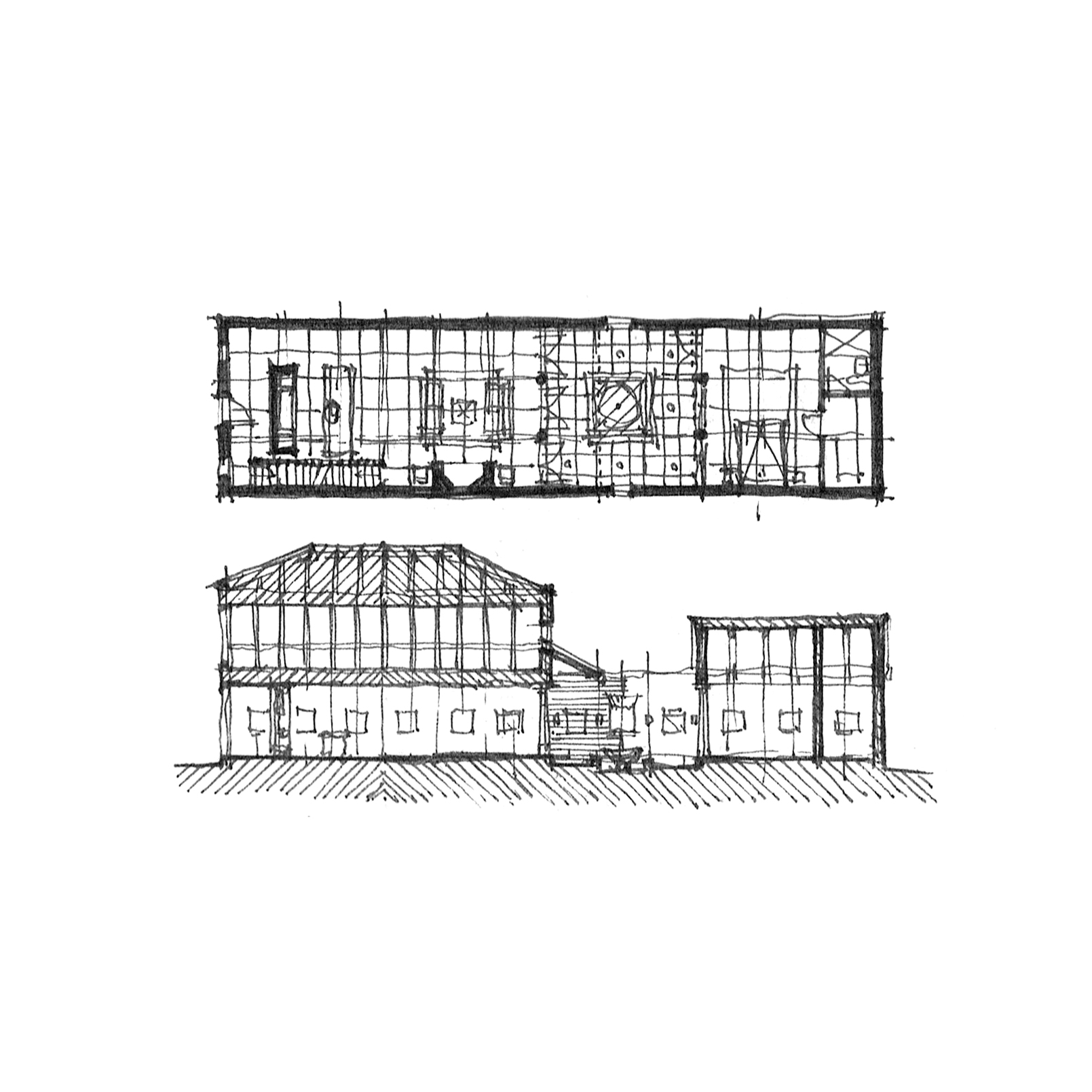
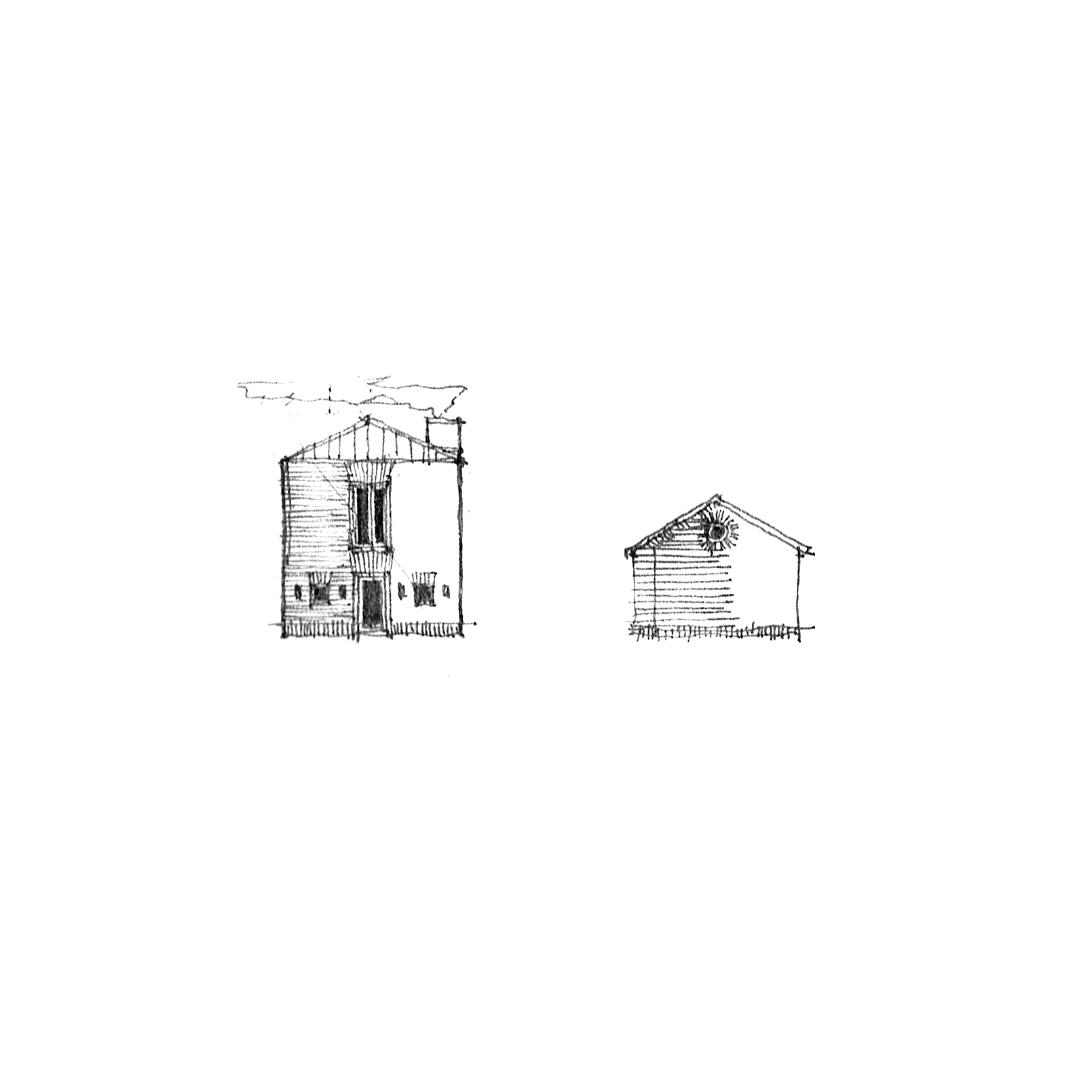
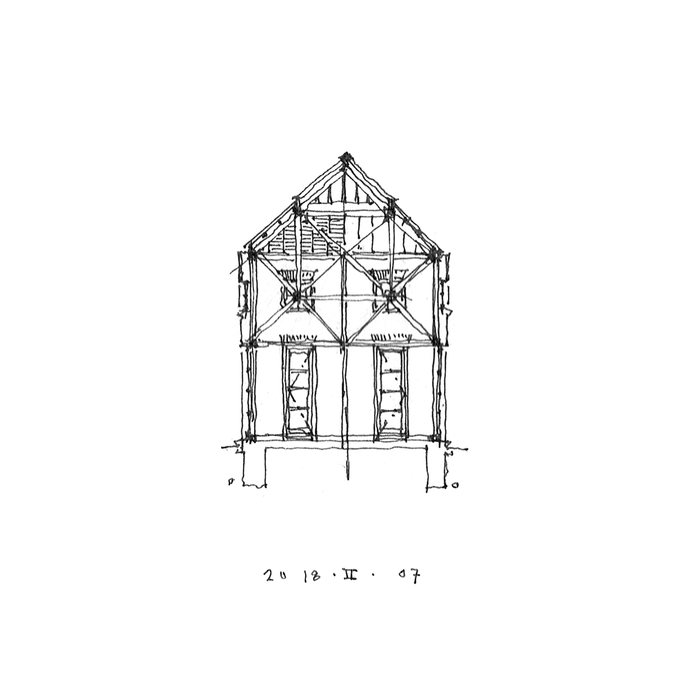
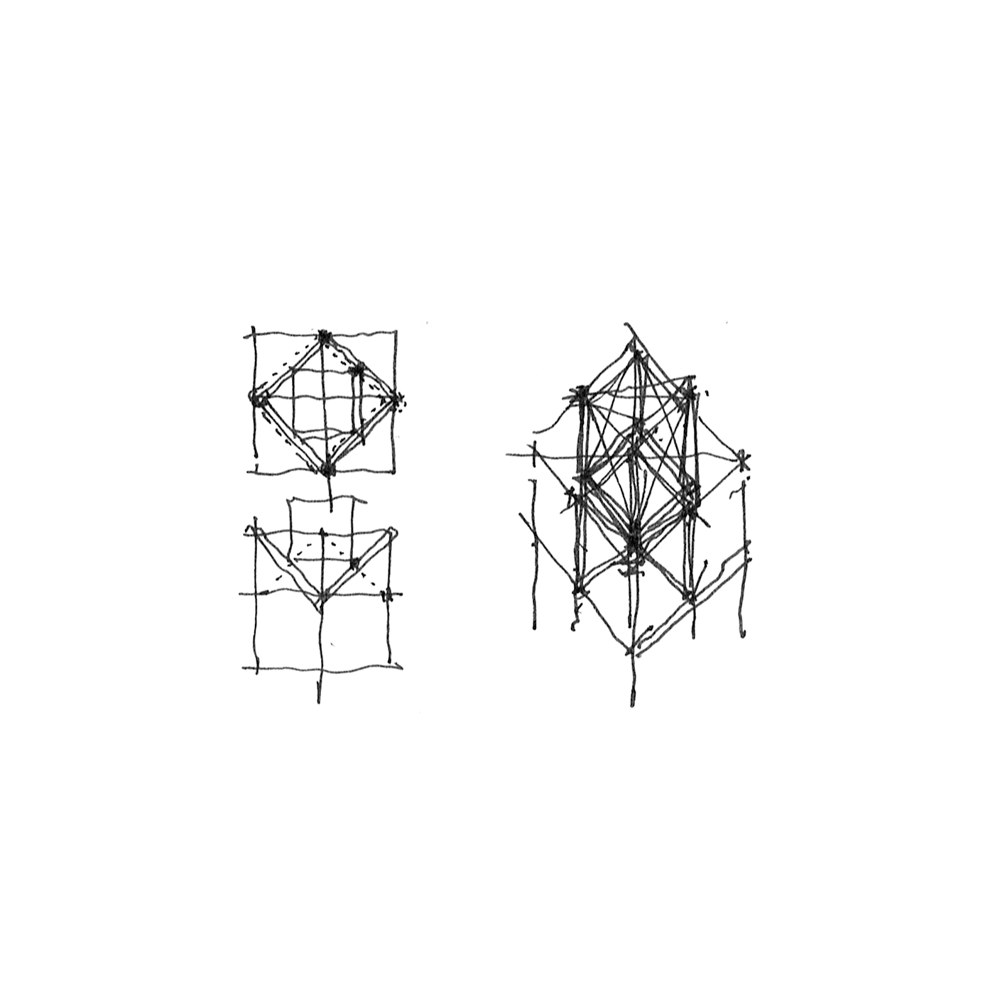
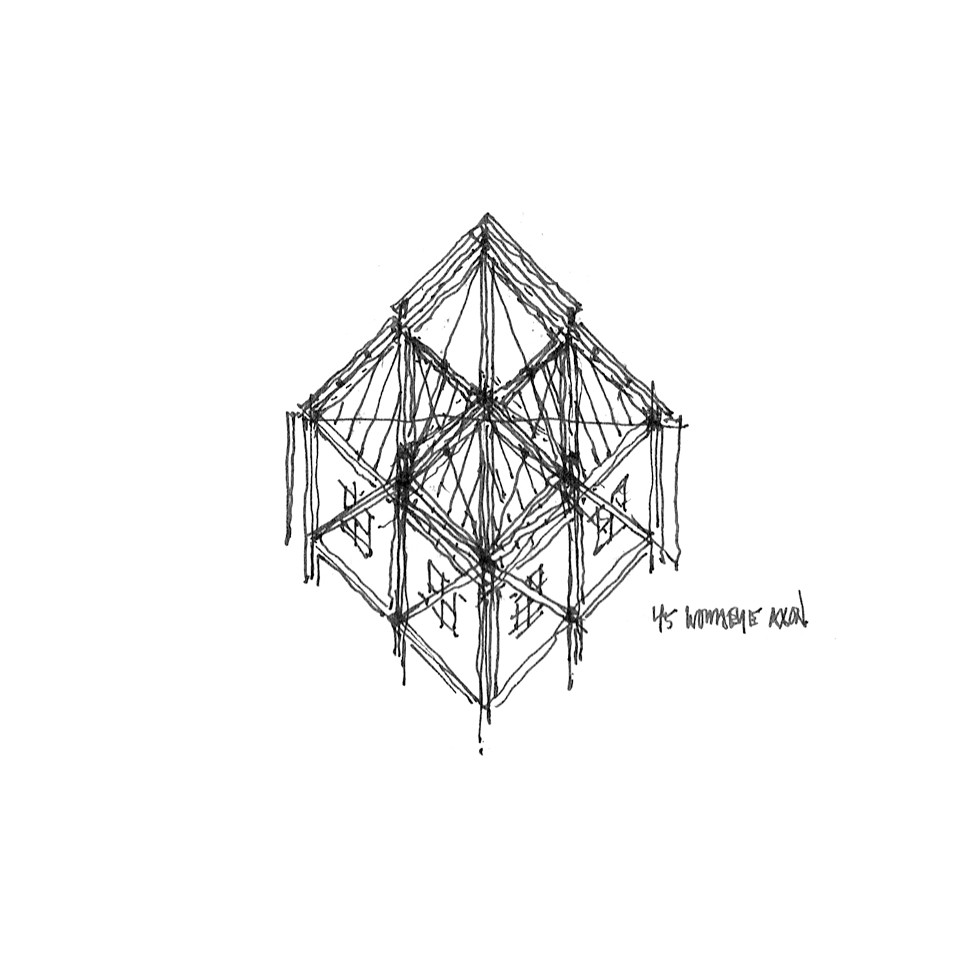
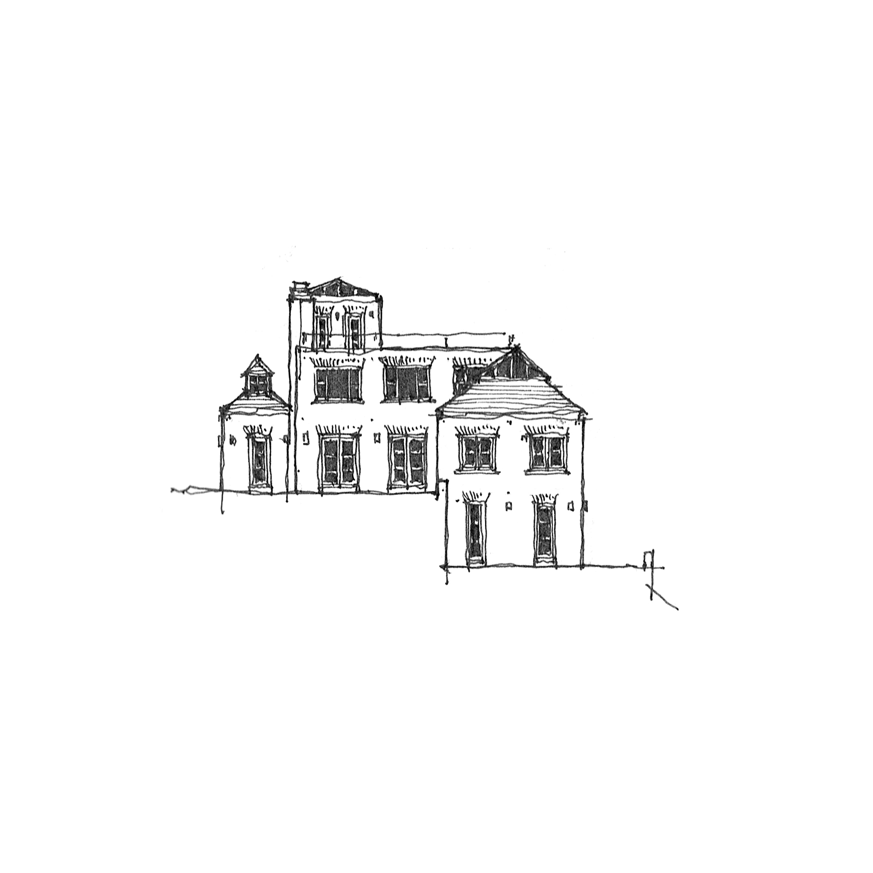
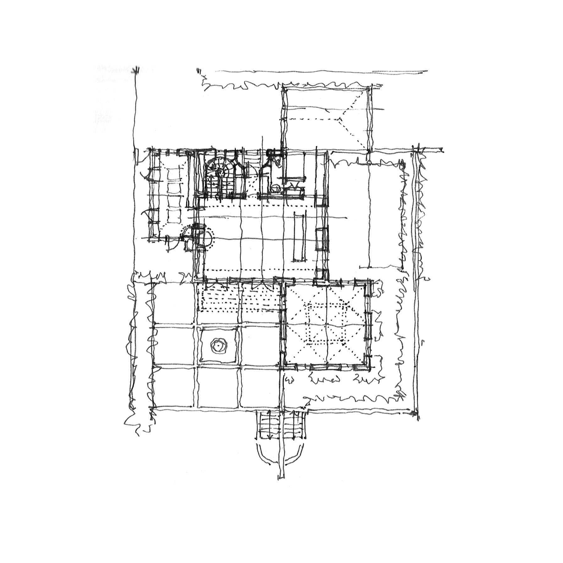
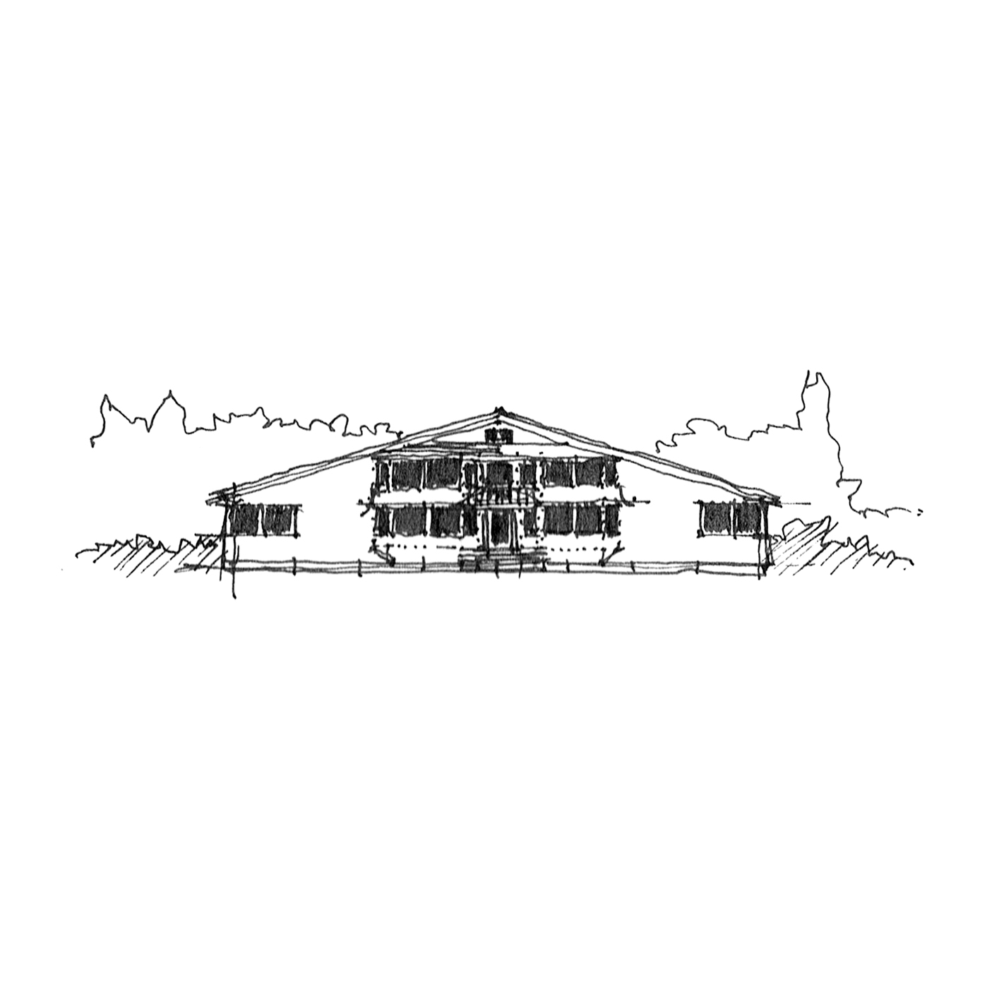
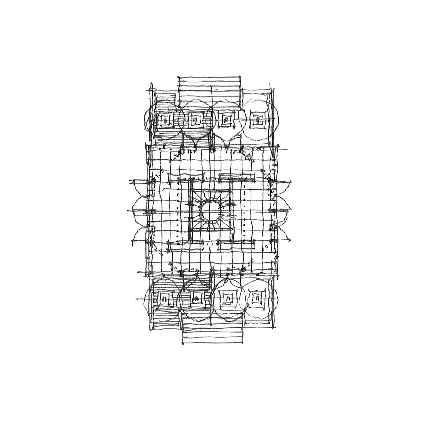
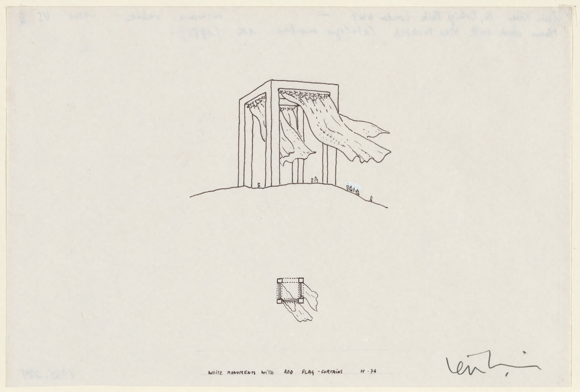
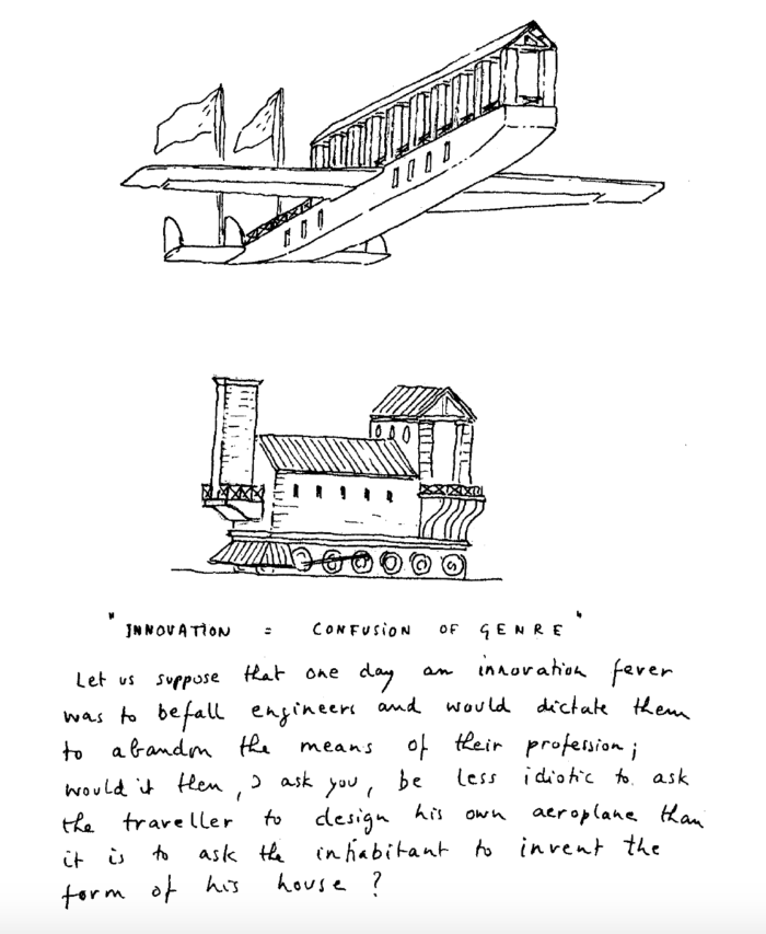
modules. shingles. tiny.

TINY_13

Today is another foray into the world of tiny homes.  Since they’re all the craze, and lend themselves to most often less-than-inspiring forms with ramshackle facades and haphazard plans, I thought I’d take a stab at taming this faddy beast.

An 8’0″ module dominates (primarily dictated by Department of Transportation trailer width standards), broken down into a smaller 2’8″ framing module.  Programmatically, the home is symmetrically loaded, with core spaces taking up the center module while a public living room occupies one end and a private bedroom the other.  The elevations are thoroughly shingled, in keeping with a preference for light-weight wood frame construction, with a lofted ceiling reaches the maximum 13’6″ allowable per DoT.

In a slightly different frame, the bottom variation takes its plan from the iconic Air Stream trailers, but disguising its streamlined roots in the equally plastic form of the wooden shingle – the Air Shingle.

TINY_11TINY_12

two squares, many arches

PORTICO-HOUSE_10

It’s been far too long – apologies are in order.

But today it’s back to basics: square and arches.  The first project is a simple study of a simple idea, instigated by an awful homespun diy renovation in my neighborhood, where a series of plaster arches had been tacked up under a shallow roof overhang, obscuring the clapboard home beneath.  I’ve ordered it a bit more, rendered in a square with access via brick steps at the corners – a four square clapboard home sheltered behind a humanist arcade.

The second project is another simple pavilion, this time with rounded corners and  centralized access.  A quick study to the right explores an arcuated form, with a centralized column instead, harkening back to the four square plan mentioned above.

PAVILION_18

a rambling house

HOUSE_10

Sometimes I’ll sit in front of a blank page of my sketchbook, pen in hand, coffee poured, for some time with seemingly no idea of what I’d like to draw, what ideas I’d like to explore – an ‘architect’s block’, if you will.  To break the silence, I might attempt to draw a floor plan of a house I know in a different style (as in this previous post, where I took the Craftsman Gamble House and reinterpreted in in the spirit of Irving Gill), or try my hand at recalling a house long gone from my personal memories and recollections.

Today’s post is an extrapolation of the latter, taking my grandparents’ sprawling home, which started as a simple 1950’s California ranch, but with multiple ad hoc additions over the years.  By placing it on a strict module, the floor plan grew a bit, but I’m happy with the result nonetheless.

A central entry off of a walled kitchen garden opens directly onto a long corridor that acts as the main circulation spine of the home, with a living/music room to the left and a large kitchen to the right.  Further past the living room, the corridor picks up again, with guest bedrooms to each side and a formal library/study at the end.  Past the kitchen, laundry and mud rooms flank the corridor with a large master suite at its end.  A formal dining room connects the living room and the kitchen, while also creating a patio on one side and pool deck on the other.  The detail below is of the central corridor, which meets Edwin Lutyens with Louis Sullivan’s Auditorium Building.

HOUSE_11

HOUSE_14

philip johnson and the rockefellers

JOHNSON_01

In 1950, Philip Johnson completed a townhome in Midtown Manhattan for the Rockefellers.  The simple mid-century modernist gem has become an icon of the halcyon era, with a black steel frame filled with a blind brick first floor and large floor-to-ceiling plate glass windows above, and an open floor plan hiding an exterior courtyard and reflecting pond, with a bedroom suite beyond.

Like most things I enjoy, I’ve re-drawn the project, but on a strict nine-square module and outfitted with a more traditional aesthetic.  The brick, not the steel frame, becomes the driving tectonic, with columns in place of sliding plate doors at the courtyard, which itself is centered on a fountain rather than floating around one.  The rear bedroom suite is more glorified with a full gable where the hip roof of the main house is tucked behind shallow brick parapets.  The front elevation remains rather blind, but trades a single french balcony window for the trio of floor-to-ceiling glass panels.

TOWNHOME_01

TOWNHOME_02

a skylit studio

VILLA_11

After taking a little well-needed vacation, I’m back with more frame.  Specifically, I’m sharing a continuation of the past two posts – a hillside studio and home.  Both of these projects included a small cubic volume topped with a pyramidal skylight.  This particular ‘studio’ typology is explored more fully here.  While the exterior is a solid white stucco-ed cube, the interior shows a four-square heavy timber frame, with a pair of wood scissor trusses forming a smaller cube at the top, which is itself topped by the skylight proper.  Since the geometry is a bit difficult to make out in these projections, I’ll draft up a quick perspective for a subsequent post.

VILLA_12

VILLA_13

VILLA_14


a hillside elevation

VILLA_09

Most often, architects design with ‘plan as generator’, that is we begin designing a building with the floor plan, and derive all the elevations, sections, and even details from it.

Today, though, is something different.  This began as an elevation – what you see above.  I was thinking something between Adolf Loos and Irving Gill, with a Richardsonian picturesque quality – a ‘character study’ if you will.  A rectangular volume makes up the center with a cubic one stepped down to the right and a smaller cube to the left, with a stair tower at the ‘rear’.

The plan – below – came after, trying to work out precisely how the different squares and modules worked together, playing localized symmetries and forms against one another, and eventually placing a formal parterre garden on the upper level with a pool deck on the lower, while a gravel auto court fleshes out the public side of the property.

VILLA_08

a studio, hillside

STUDIO_06

Small (often illegal) studios riddle the Hollywood Hills, where all ilk of entertainment-oriented folk hash out their hits and edit down their next Oscar-worthy performances. . . or so the stereotype goes.

This is such a studio – a miniature white cube set deep into the hillside with a service shed and private garden adjacent.  Upon approach, only the pyramidal skylight is visible, slowly revealing the tall archways underneath upon descending a spiral stair.  The form itself owes much to both Irving Gill and O.M. Ungers, with a few picturesque moments from Wallace Neff’s Spanish Colonial Revivalism thrown in for good measure.  Upcoming posts will feature the interior of the studio, with that large skylight and intricate trusswork above.

a tale of two long, ‘low’, gables

HOUSE_17

What we have today is a study in similarities and contrasts – two houses, separated by a continent in distance (and climate), two distinct architectural styles (and building materials), and about fifty or so years of time (and appreciation.

The first (up top), is McKim Mead & White’s iconic Low House of 1886 at Bristol, Rhode Island, a long shallow gable of shingles, punctured by a subtle staccato of windows and oriels, all subsumed into the larger singular gable form.  The second, Cary Grant’s Spanish Colonial Palm Springs residence of 1930, a shallow stuccoed gable punctured by deep-set windows and shaded by deep eaves and wood porches (now partially obscured by a later Wallace Neff designed addition).*

So naturally, why not try to bang ’em together?  My initial reaction (below) is probably more Low than Grant, with protruding bays and banded windows, but is coated in white stucco like its Californian pedigree.  I suppose a few more deep-set singular casement windows might just do the trick.

HOUSE_18

* Apparently, the home was originally constructed by Santa Monica based architect John Byers for one Julian Noles, a recent west coast transplant from Chicago – more info here.

eccentrically braced mies

HOUSE_16

While studying for my last licensing exam, I found some simple and elegant diagrams of different steel frame systems (something like this or this).  While the concentrically braced frame has been a hallmark of certain strains of Miesian modernism (Craig Ellwood, anyone? or here), I couldn’t think of an instance where the eccentrically braced frame had made its feature debut.  So I drew one.  I’ll admit that I had recently had octagon houses on the brain, so that same geometry surfaced here, where the eccentric braces on the four principal facades curve back in on each other to form an interior octagonal form, obscured by the square glazed exterior.

HOUSE_15

a quonset. a barn. a home.

BARN_18

As any casual observer of this ‘drawg’ will note, I have quite an affinity for the vernacular architectures of the Americas.  My family’s winter trips to rural Oklahoma have offered me a greater opportunity to acquaint myself with the seemingly endless variety that the vernacular languages offord.

This is yet another home in a barn – yet this time a quonset-roofed barn, where the structural rigidity of the expansive roof comes from its circular geometry rather than the elaborate king-post trusses typical of agrarian structures.  The top variation uses shed roof lean-to’s to house ancillary spaces, while placing main living areas under the quonset proper, while the section and plan below explore formal variations on the quonset itself.

BARN_17