modules. shingles. tiny.

TINY_13

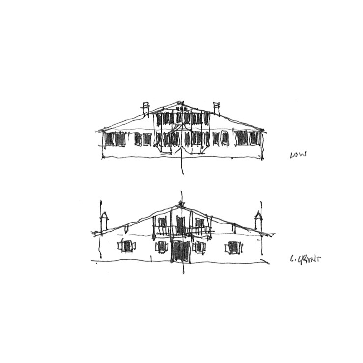
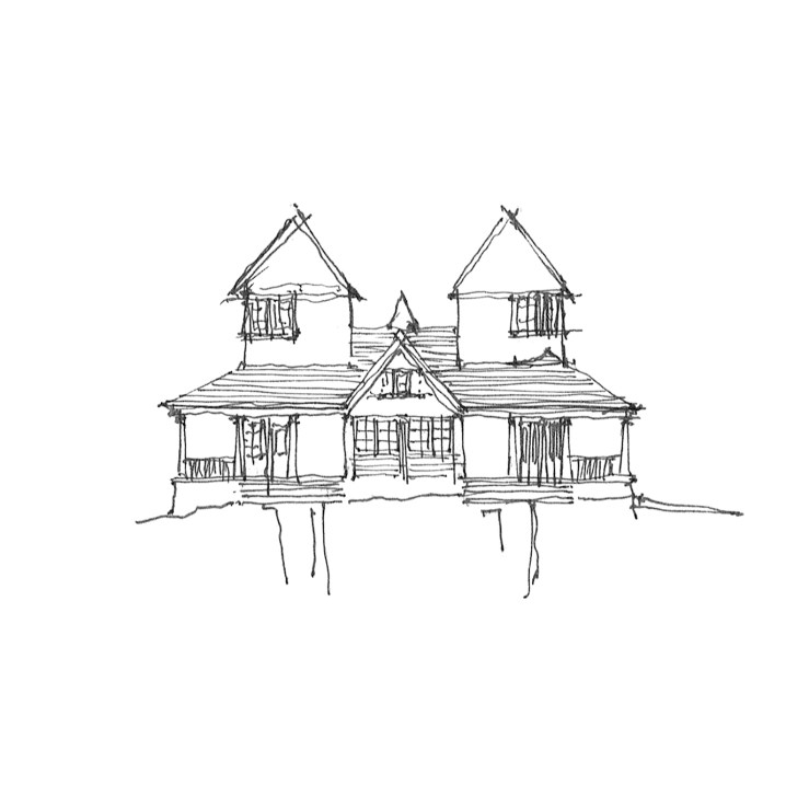
Today is another foray into the world of tiny homes.  Since they’re all the craze, and lend themselves to most often less-than-inspiring forms with ramshackle facades and haphazard plans, I thought I’d take a stab at taming this faddy beast.

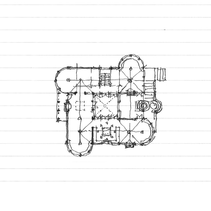
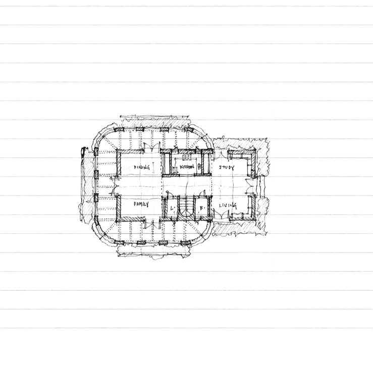
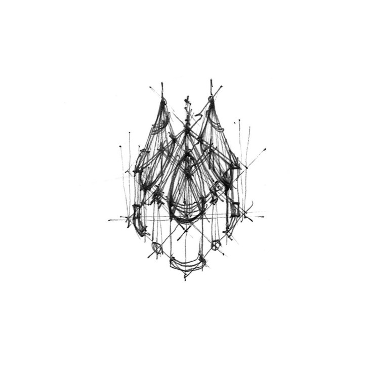
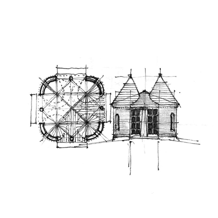
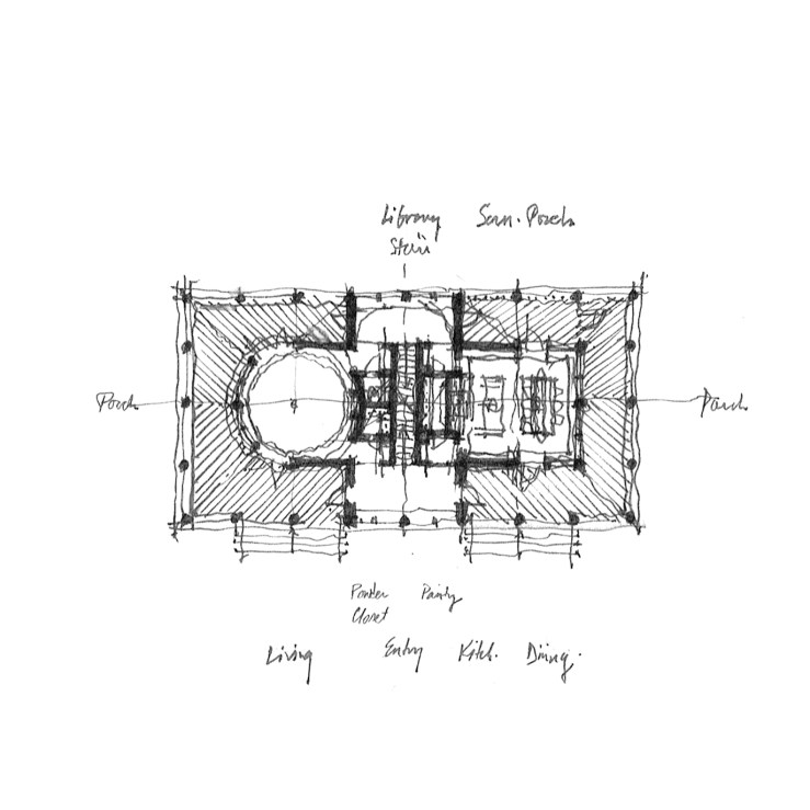
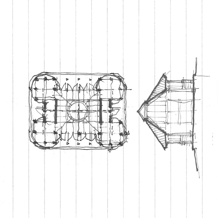
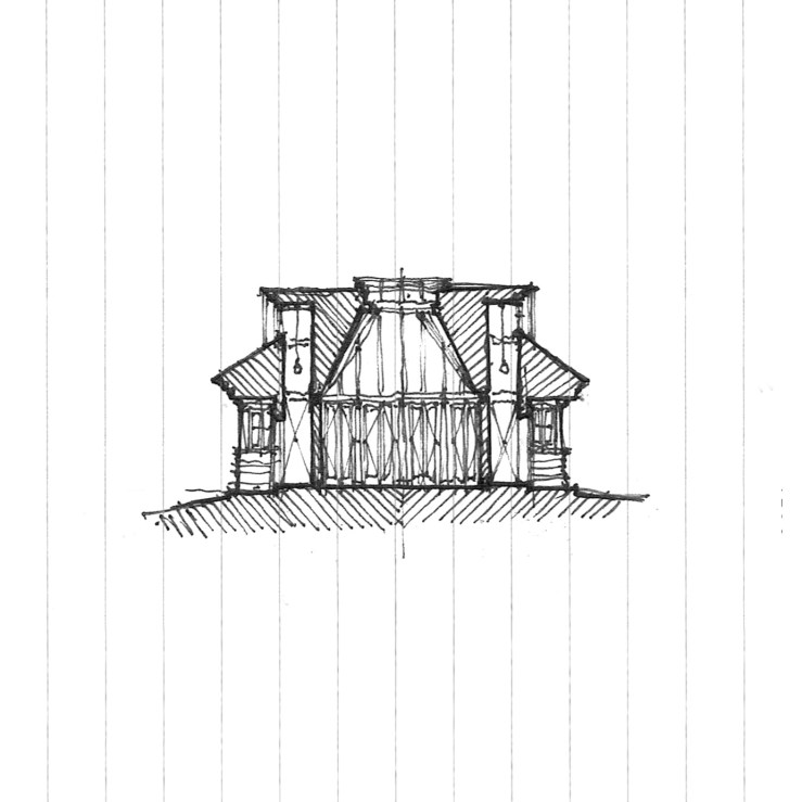
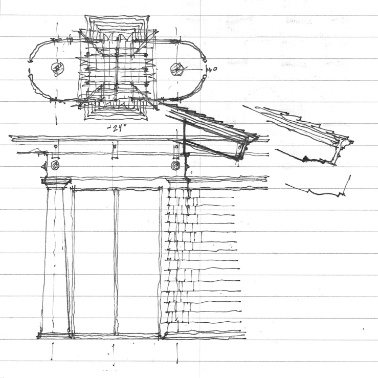
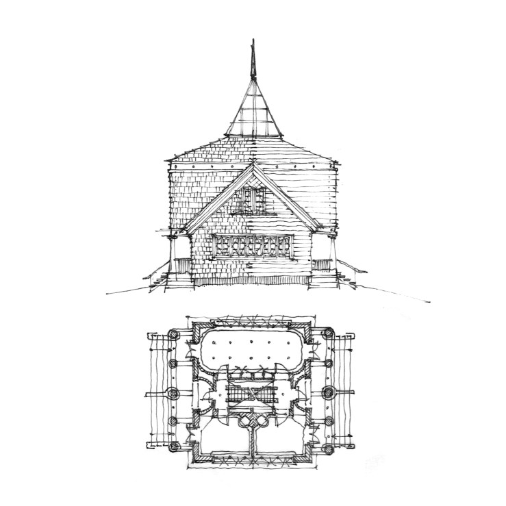
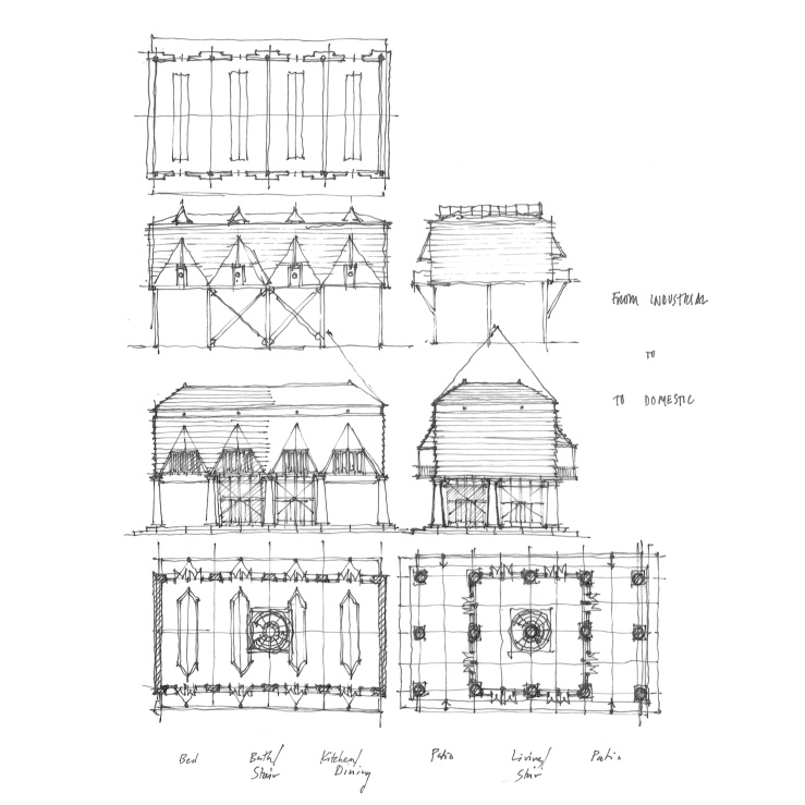
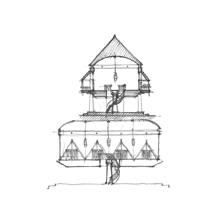
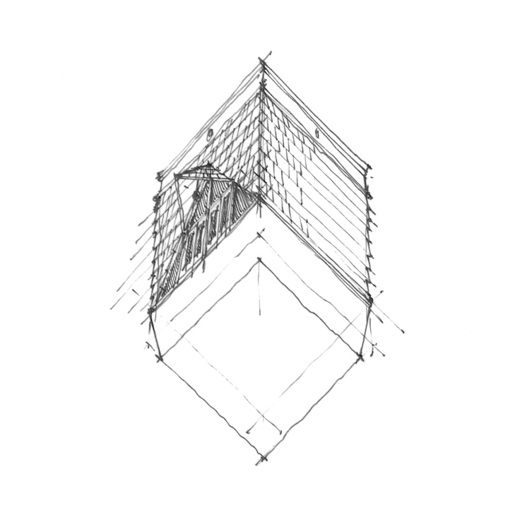
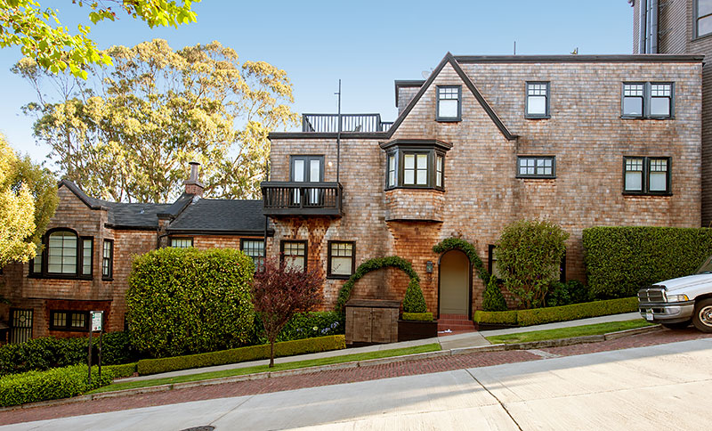
An 8’0″ module dominates (primarily dictated by Department of Transportation trailer width standards), broken down into a smaller 2’8″ framing module.  Programmatically, the home is symmetrically loaded, with core spaces taking up the center module while a public living room occupies one end and a private bedroom the other.  The elevations are thoroughly shingled, in keeping with a preference for light-weight wood frame construction, with a lofted ceiling reaches the maximum 13’6″ allowable per DoT.

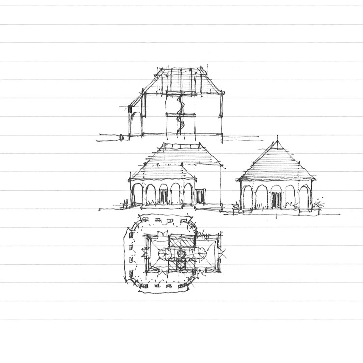
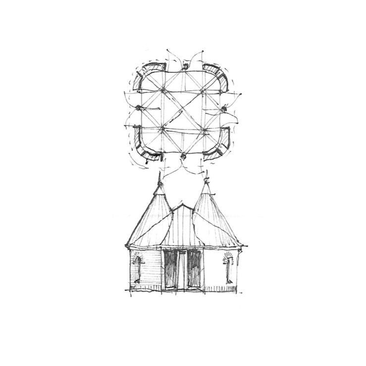
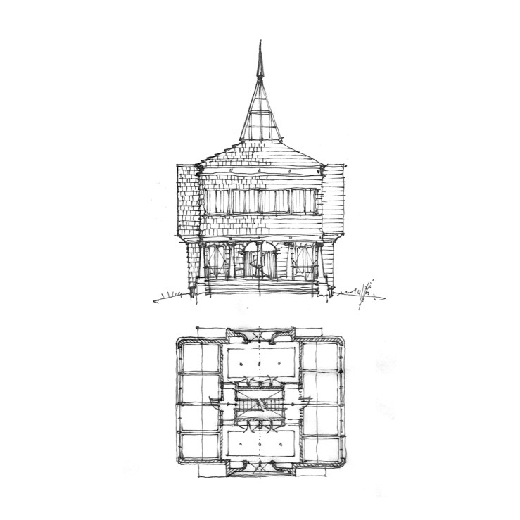
In a slightly different frame, the bottom variation takes its plan from the iconic Air Stream trailers, but disguising its streamlined roots in the equally plastic form of the wooden shingle – the Air Shingle.

TINY_11TINY_12

a tale of two long, ‘low’, gables

HOUSE_17

What we have today is a study in similarities and contrasts – two houses, separated by a continent in distance (and climate), two distinct architectural styles (and building materials), and about fifty or so years of time (and appreciation.

The first (up top), is McKim Mead & White’s iconic Low House of 1886 at Bristol, Rhode Island, a long shallow gable of shingles, punctured by a subtle staccato of windows and oriels, all subsumed into the larger singular gable form.  The second, Cary Grant’s Spanish Colonial Palm Springs residence of 1930, a shallow stuccoed gable punctured by deep-set windows and shaded by deep eaves and wood porches (now partially obscured by a later Wallace Neff designed addition).*

So naturally, why not try to bang ’em together?  My initial reaction (below) is probably more Low than Grant, with protruding bays and banded windows, but is coated in white stucco like its Californian pedigree.  I suppose a few more deep-set singular casement windows might just do the trick.

HOUSE_18

* Apparently, the home was originally constructed by Santa Monica based architect John Byers for one Julian Noles, a recent west coast transplant from Chicago – more info here.

a hillside courtyard

HILL-HOUSE_02

I don’t know why courtyards intrigue me so much.  Perhaps it’s due to my living in the sun-drenched foothills of Southern California, where courtyard typologies have long dotted the land to provide shade in the summer and protect against winter winds.

Today’s project is yet another courtyard house.  This time stemming from a relative’s home perched atop the rolling hills of San Diego county.  The layout is simple:  A small patio protects the front door (to the left on the drawing), with a living room just beyond, a dining room to the right, and the kitchen and family room further yet; to the left are bedrooms and baths, with a stair down to a lower level tucked into the hillside below; a central courtyard is flanked by a covered patio which opens onto tiered terraces and stairs beyond.

Formally, my initial studies (below) were rather rectangular, with only one oriel window at the family room.  However, I couldn’t resist the fun a pinwheel-ed series of oriels would provide, lending one each to the family room, the master bedroom, a guest bedroom, and the dining room.  Here the plan takes cues from McKim Mead & White’s two casinos at Newport (also here) and Narragansett, with a dash of the Bell House (also here).  The bottom sketch further investigates a circular series of stairs at the patio, referencing the predominance of half-round oriel figures in the remainder of the plan.

HILL-HOUSE_03HILL-HOUSE_04HILL-HOUSE_05

another house. another veranda

PORTICO-HOUSE_06

Some time ago, I shared a very Irving-Gill-dependent rectangular home with a wrap-around arcaded veranda.  Today, I’m offering a new take on that plan – taking a cue from the Shingle Style and rounding out the corners of the veranda, and subsuming the whole under a large, steeply pitched hip roof.  Here, the veranda is more closely tied to the rectangular volume behind it, rather than merely acting as a stand-alone wrapper.  Personally, I find both equally interesting, but I’ll let you take your pick.

PORTICO-HOUSE_05

a pavilion

PAVILION_05

Today’s post is a small pavilion, four-square with on-center columns at each facade, radius-ed corners, each topped with a miniature turret and blended into a larger hip roof.  Bits of Richardson clash with modernist modularity, postmodern idiom, and multiple readings in the plan (a diamond? a cruciform? nine-square even?).  While I’ve drawn the exterior in brick, it could work wonderfully shingled or in clapboard, perhaps even stucco.

PAVILION_04

PAVILION_06

porches, squares, and circles

porch-house_06

This project stems from a building I passed by every so often living in New Haven, CT.  Two or three Victorian and Colonial homes had been repurposed as a school, with one long porch wrapping all of the various buildings into one.  My proposal here places two opposite forms – one square, the other circular – against one another, united by a shared central staircase and a wrap-around porch, as one house with two identities.  The bottom elevation shows a variation, with a larger second floor and attic, but the basic idea is lost. . .

porch-house_04

porch-house_05

porch-house_07


turrets and gables

gablesturrets_04

No program here, just form, where circles and squares meet, compete, and transform into one another.  Four cubic pavilions are set at the corners of a large conic square hall (the roof form echoes a very early post, a form which I’ve been interested in for some time).  The whole sits under a dutch gable roof, with a central skylight, and circular turrets on top of the square pavilions.

gablesturrets_03

gablesturrets_02

language & detail

garden-pavilion_04

Sometimes the drawings I post seem rather schematic, but as part of the great importance of building  in architecture, they can never remain that way.  Here I present you with a more detailed take of a recent post, with hybrid Tuscan-Doric columns (perhaps Graves doing Doric, maybe?), minimal Mies-ian window jambs and stops, shingled wall with a moulded cap to make the column in antis, all topped with a simplified architrave, rosettes replacing triglyphs.  I fancy the wood work might all be painted a glossy black, similar to Earnest Coxhead’s shingled houses in San Francisco (and Bob Stern’s take on them).

a house with a hall

hall-house_01

Plan as generator (aka, ‘floor plan comes first, elevations second’), with a long hallway bisecting a semi-cubic volume, colonnades at either end.  Now a staircase – centered on the hallway, one half of the house takes a large ballroom, while the other is bisected into two smaller drawing rooms. The second floor, two long, windowed rooms sit over the porches, while a tall pyramidal skylight tops the stair hall.

hall-house_02

from industrial to domestic

PILOTI_02

Today’s piece stems from an industrial building I passed by at Los Angeles’ wastewater treatment plant.  The original was a blue corrugated steel box on diagonally braced stilts, with triangular recesses and frames above second story doors.  I have no idea what this is used for.  None.  But The deliberateness of the design was evident, as the entire plant had been drawn up by Anthony Lumsden, a techno-postmodernist.  So I clad it in shingles, inspired by some triangular dormers by Ike Kligerman Barkley, and set it on a chunky Tuscan colonnade (a la Graves), and called it ‘house’.

PILOTI_01

PILOTI_03