philip johnson and the rockefellers

JOHNSON_01

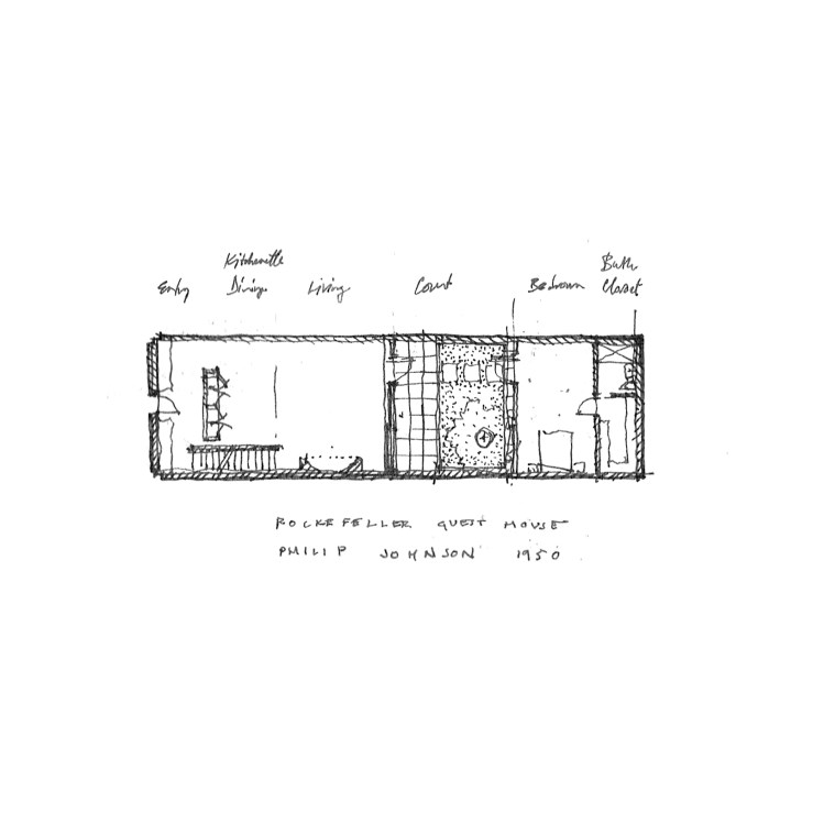
In 1950, Philip Johnson completed a townhome in Midtown Manhattan for the Rockefellers.  The simple mid-century modernist gem has become an icon of the halcyon era, with a black steel frame filled with a blind brick first floor and large floor-to-ceiling plate glass windows above, and an open floor plan hiding an exterior courtyard and reflecting pond, with a bedroom suite beyond.

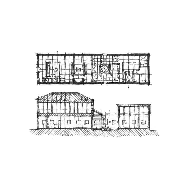
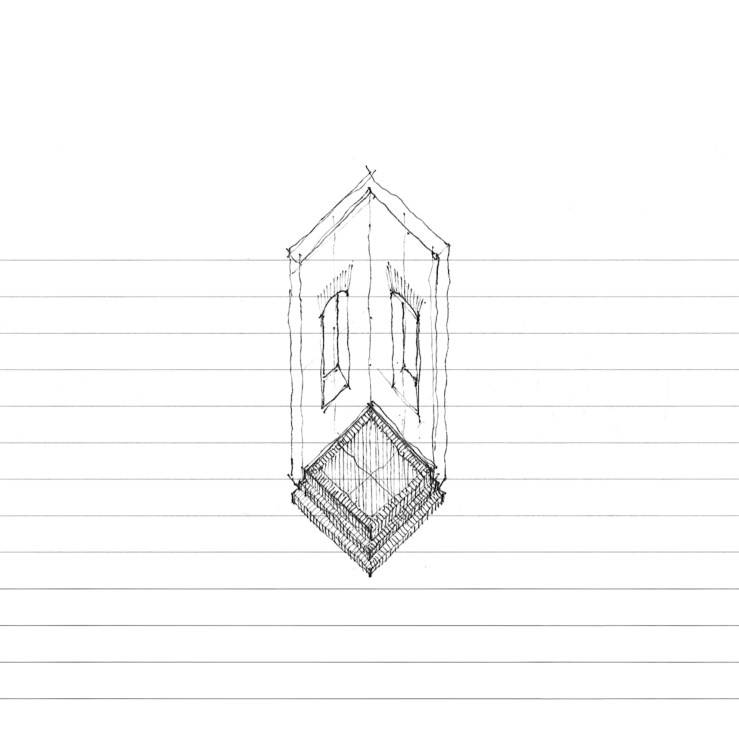
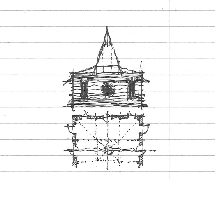
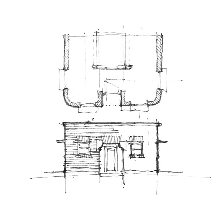
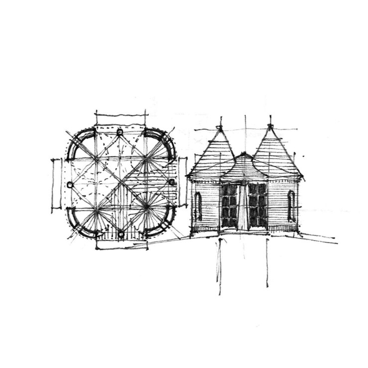
Like most things I enjoy, I’ve re-drawn the project, but on a strict nine-square module and outfitted with a more traditional aesthetic.  The brick, not the steel frame, becomes the driving tectonic, with columns in place of sliding plate doors at the courtyard, which itself is centered on a fountain rather than floating around one.  The rear bedroom suite is more glorified with a full gable where the hip roof of the main house is tucked behind shallow brick parapets.  The front elevation remains rather blind, but trades a single french balcony window for the trio of floor-to-ceiling glass panels.

TOWNHOME_01

TOWNHOME_02

neo-rationalism in the basque country

TOWN-HALL_02

In 1980, Jose Ignacio Linazasoro designed a deceptively simple renovation of a town hall at Segura in the Basque region of Guipuzcoa.  While Linazasoro’s current work is of a decidedly modernist vocabulary, his earliest work was more neo-rationalist, taking heavy cues from Rossi and Krier (he even worked in the office of Venturi Scott Brown for a time).  The town hall renovation in question reorganized the historic palacio to front an adjacent garden, adding a deep Syrian arch off of a square brick patio, and a long brick-columned pergola overlooking a deep valley and river beyond.

The top drawing outlines the new garden with an idealized ground floor plan of the palacio, while the drawing below is of the square patio itself, complete with herringbone brickwork, stone jointing, and a partial elevation of the archway.

TOWN-HALL_01

mid century modernism goes traditional

COURTYARD-HOUSE_22

Having begun my architectural education in Southern California, Mid-Century Modernism (and especially Richard Neutra*) has always held a place of honor in my personal canon – MadMen be damned.  Among the Eastern variants of that style, the Harvard Five are most likely the most influential.

Today’s work is a variation on Eliot Noyes’ own home at New Canaan, CT.  Effectively, I’ve taken the iconic low-slung, masonry-clad, flat-roofed house and swapped its stylistic elements for more traditional, vernacular ones: an arched entry opens to a colonnaded patio; hip roofs with exposed trusswork sit over the living rooms and bedrooms; and double glass doors replace the sliding panels that so often fail.  A brick variation is below, with jack arches in place of the wood trabeation found above.

COURTYARD-HOUSE_23

*Growing up around his buildings at the Crystal Cathedral didn’t hurt either. . .

at home in a tithe barn

BARN_16

Today’s project takes its impetus from the tithe barn (Fr. grange dimiere), medieval structures used to collect villagers’ tithes, which prior to the proliferation of cash was often given as a portion (one tenth) of the individual’s harvest.  These cumulative tithes required an elaborate barn to store them for safekeeping throughout the following year.  The structures are fabulous syntheses of the ecclesiastical and the secular – large, windowless stone or brick fortresses with soaring trussed, nave-like, roofs.

Barn conversions are fascinating to me, with the domesticization of the agricultural, and the tithe barn is no less so.  This project attempts to take the typical tithe barn and meet it with the domestic, with a large enclosed courtyard to compliment the truss-framed living room.

BARN_15

a gazebo

GAZEBO_01

I like circles.  I like squares.  I like circles and squares together.  This is a gazebo.  It has a square brick base with four Tuscan columns.  These support a circular lintel with conical purlins.  The drawing below does not have a circle.  It is kind of boring.

That is all.

GAZEBO_02

lutyens does a square

LUTYENS_06

Today, merely an elevation and roof/floor plan of a simple structure Edwin Lutyens designed at Middleton Park, where a pair of these cubic houses form the gatehouse entry to a much larger country estate.  Why I enjoy it, and why I represent it here, is because it is one of Lutyen’s only square/cubic projects, where the picturesque goes to the wayside in an exercise of formal purity.  A large hip roof mounts the brick and stone Georgian base, where two dormers are set aligned with the windows beneath on two sides, and one dormer is centered on other two.  A large central chimney sprouts from the ridge.  The house itself is built into a larger gate, with two eagles perched atop, flanking the gateway.

Apparently, you can live in one . . .

pyramidal roofs

PAVILION_07

Above, a small pavilion built into a wall, which I imagine could extend quite some ways beyond where I’ve drawn it.  The roof, a tall shingled pyramid.

Below, a roof that modulates between a square base and a round oculus at the crown, again figured as a tall, shingled pyramid.

Come to think of it, what if we combined the two, a really long wall with a larger rotated square pavilion cut out of a portion of it (and I mean, big, like Krier big), topped with a tall, oculus-ed, pyramid?  Maybe tomorrow.

CONEHEAD_03

CONEHEAD_02

sets, bricks, jacks, and squares

SET_02

From Donald Judd and the architecture of art last week, I bring another tangentially architectural enterprise today: set design.  This work came about through viewing terribly underwhelming sets at the local opera.  My thoughts began to race about how the story could have been more magnificently communicated through architectural form rather than a few gauzy curtains.  This version positions a continuous brick jack arcade along the entire upstage, with four brick ‘el’s that could move about in the foreground, turning towards the audience for an ‘interior’ perspective, or away for the ‘exterior’, or alternated in-and-out, aligned into two open ‘rooms’, or one closed off cube.  Allusions to the work of Edward Gordon Craig, Adolphe Appia, and Richard Peduzzi abound.

SET_01

two facade studies and a rotunda

CONEHEAD_01

Facade as generator: that is, starting with a facade and working back to a floor plan instead of the opposite, more traditional, fashion.  Here, a scored plaster exterior references brick construction, with radiating joints at the circular window and jack arches over the rectangular side windows.  A tall pyramidal skylight centers the whole.

FACADE_01

Another facade, this time actual brick with rounded corners, simple square double-hung windows under jack arches with thin metal overhangs and stone shoulders at the inset front door.  The plan suggests a small linear courtyard at the center.

ROTUNDA_01

This circular rotunda has a few things going on in plan that a section won’t illustrate.  But not to mind, for the section shows enough of its own intrigue.  The dome is cut, making it shallow at the center than the ends.  A large skylight sits above, illustrated here as a small tempietto, a room beyond a room, above which the skylight proper is positioned.

a pavilion

PAVILION_05

Today’s post is a small pavilion, four-square with on-center columns at each facade, radius-ed corners, each topped with a miniature turret and blended into a larger hip roof.  Bits of Richardson clash with modernist modularity, postmodern idiom, and multiple readings in the plan (a diamond? a cruciform? nine-square even?).  While I’ve drawn the exterior in brick, it could work wonderfully shingled or in clapboard, perhaps even stucco.

PAVILION_04

PAVILION_06