Yet another take on the theme, this time with a symmetrical wrapper, with studies on how the core might sit within the volume. The thought was to more directly synthesize Wright’s Usonian Houses with Mies’ 50X50 House. But more on those later.
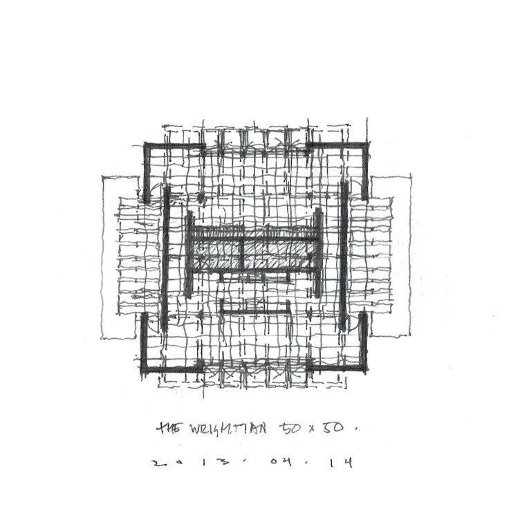
Yet another take on the theme, this time with a symmetrical wrapper, with studies on how the core might sit within the volume. The thought was to more directly synthesize Wright’s Usonian Houses with Mies’ 50X50 House. But more on those later.
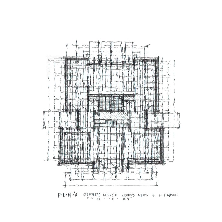
So I took the Cheney house plan and put it on Mies’ module, replaced the central hearth with a modified Farnsworth core just to see what happened. Iterations ensued, and even Schinkel reared his head.

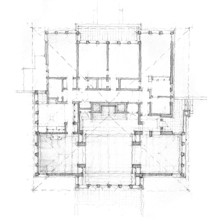
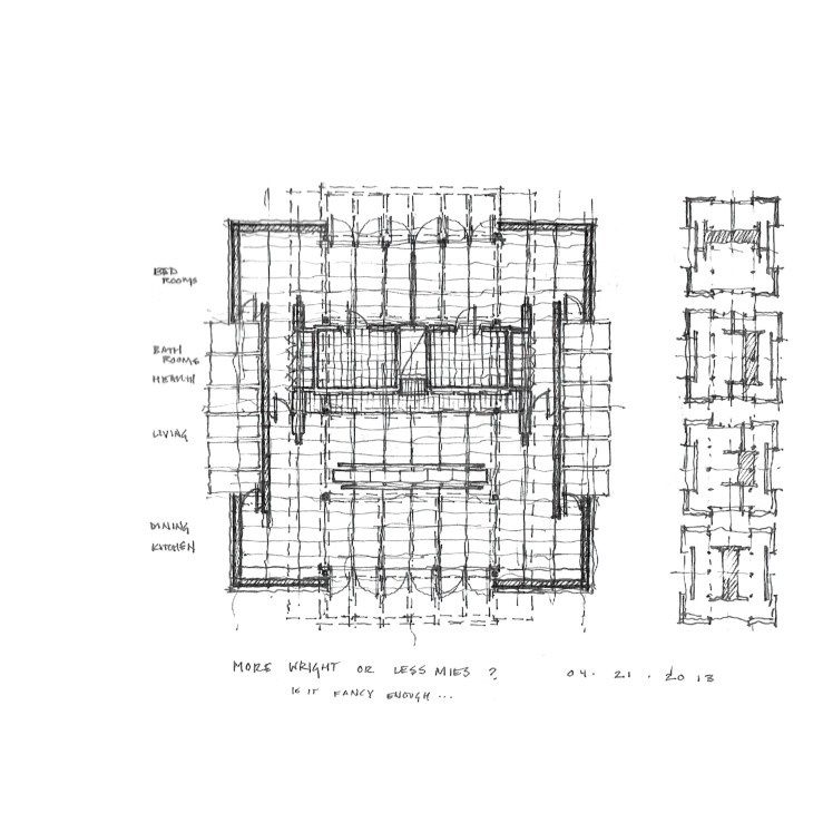
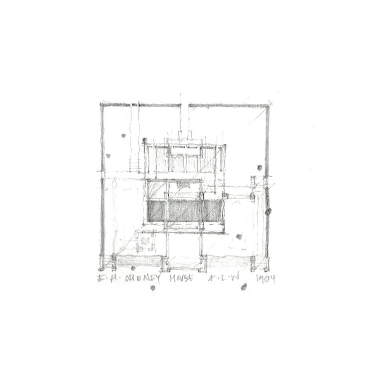
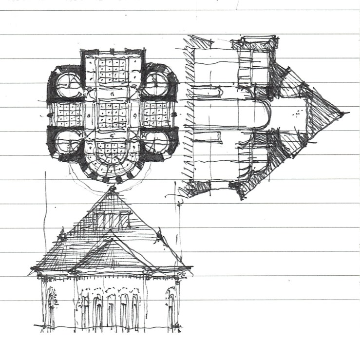
Keeping the Chicago theme, but moving a bit back in time, today I’ll feature some early Frank Lloyd Wright, particularly the Cheney House in nearby Oak Park. The plan is fascinating because it is an effectively square structure under a large hip roof, divided into two halves: the front is made up of three public rooms (nine square), while the back is broken into four bedrooms (four square), with servant spaces filling out the middle. The hearth is at the very center of the house, typical Wright. This basic parti (formal planimetric diagram) still fascinates me to this day – a simple form with a complex, yet brutally clear interior logic. The variations it inspired will follow over the coming days.
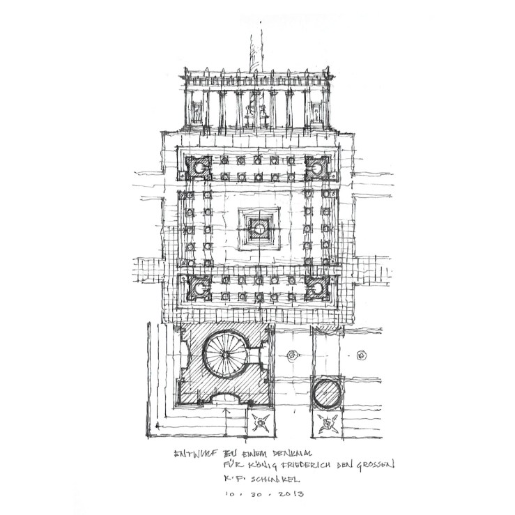
It’s been a long week of Mies, Mies, and yet more Mies. So here’s a bit of a respite from the daunting Modernism his work exemplifies: Karl Friedrich Schinkel. And yet, there’s something afoot – a link between Mies and Schinkel, which I am definitely not the first to make (see Kenneth Frampton and Thomas Beeby). But whatever the reason, take a little solace in the capitals, pilasters, and peristyles – if only for the now.

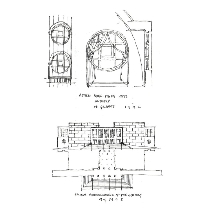
Between reading a biography on H. H. Richardson and glancing through one of Michael Graves’ volumes, I thought up this little dormer – taken from the cantilevered round dormers found throughout Richardson’s work (and the Shingle Style at large), and met it with a perfect circular window (divided into nine lites, of course) such as Graves was wont to use, and made into a lantern of sorts, having windows on two sides. My documentation of Graves’ examples follows.
Where the previous project offered more of a synthesis between the modern and the classical in terms of style, this one poses a synthesis between types – structuring a basilica form with equal transepts, similar to a Greek cross. This hybrid typology is not new, and can be found in early Christian churches, such as San Nazaro in Brolo or the Basilica di San Marco in Venice. Stylistically, my interpretation takes cues from H. H. Richardson, with thick masonry walls, continuous cornice lines, and a large hip roof, which obscures the tower over the crossing from the outside. Below are earlier studies of a similar plan with much different attitudes towards envelope.

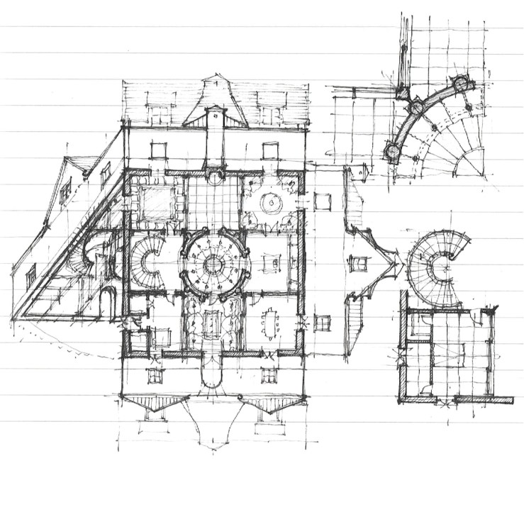
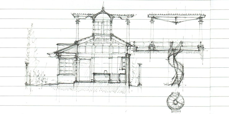
As per the request of one commentor, I spent some time this weekend fleshing out the project featured in last week’s post ‘courtyards, nine squares, and robert a. m. stern‘. Plan with elevations, enlarged plans and axon above; perspective, details, and roof plan below.


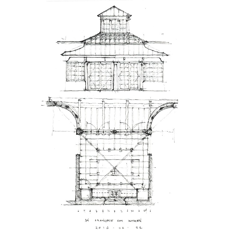
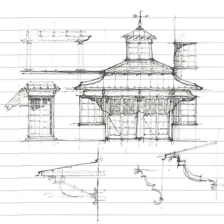
One of the joys of home ownership is also one of it’s banes: renovations. I’m painfully aware of the many alterations or changes I would make to our home, and rather than let these become points of consternation or despair, I’d rather use them as moments of critical thought. So I draw. This kitchen is a thought of what I might like to do to our little Spanish cottage if given the wherewithal. Formally, it takes its cues from the European orangerie tradition – somewhere between a living room and a greenhouse, and marries that typology with some Irving Gill-like elements.


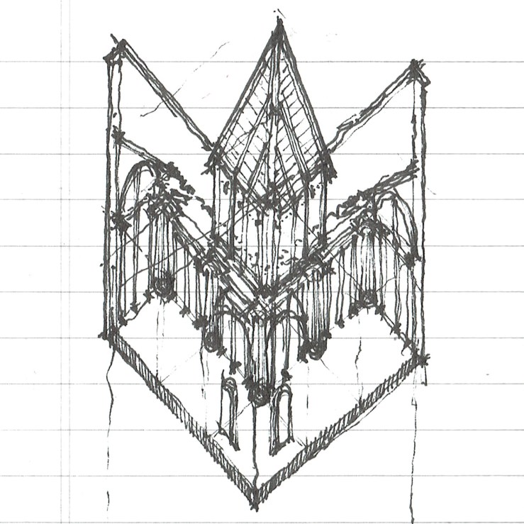
I was digging through my sketchbooks and found a nice little partial wormseye axonometric drawing that should have been a part of an earlier post. This one may be a bit more difficult to understand, seeing as it’s a pretty unusual type of drawing. But effectively, what I’ve done is drawn a corner of the project looking from underneath the building, as if the ground wasn’t there.
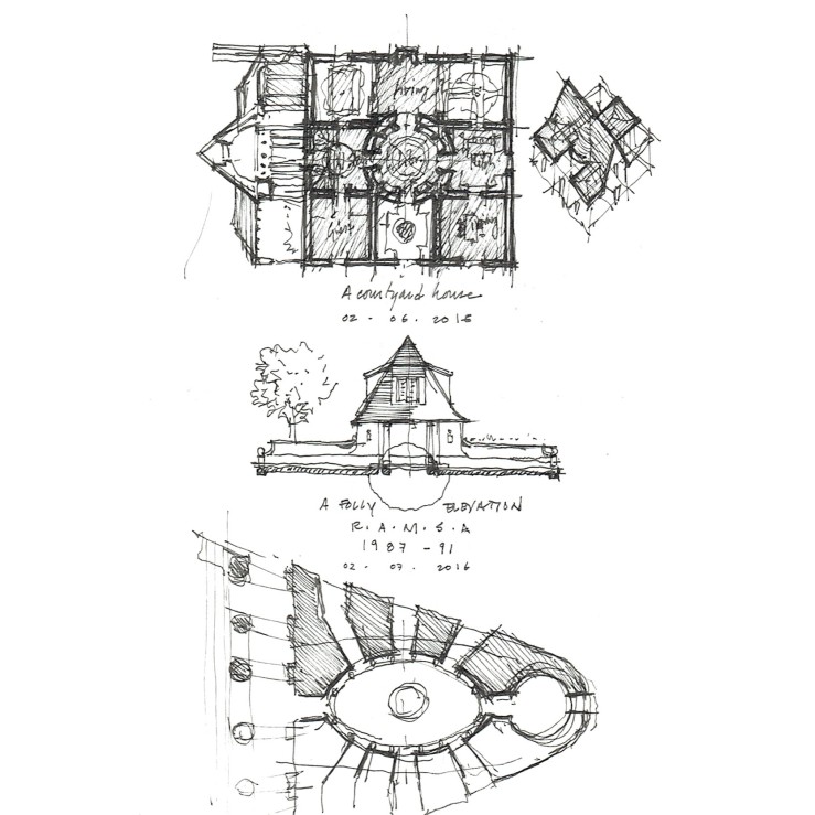
For the past three weeks, I’ve kept a volume of Robert A. M. Stern’s work on my bedside table, along with Henry Russell Hitchcock’s biography of H. H. Richardson. But more on Richardson later. The drawing above shows a small garden folly elevation by Stern as well as a nine-square courtyard house it inspired below. More Stern-spiration to come.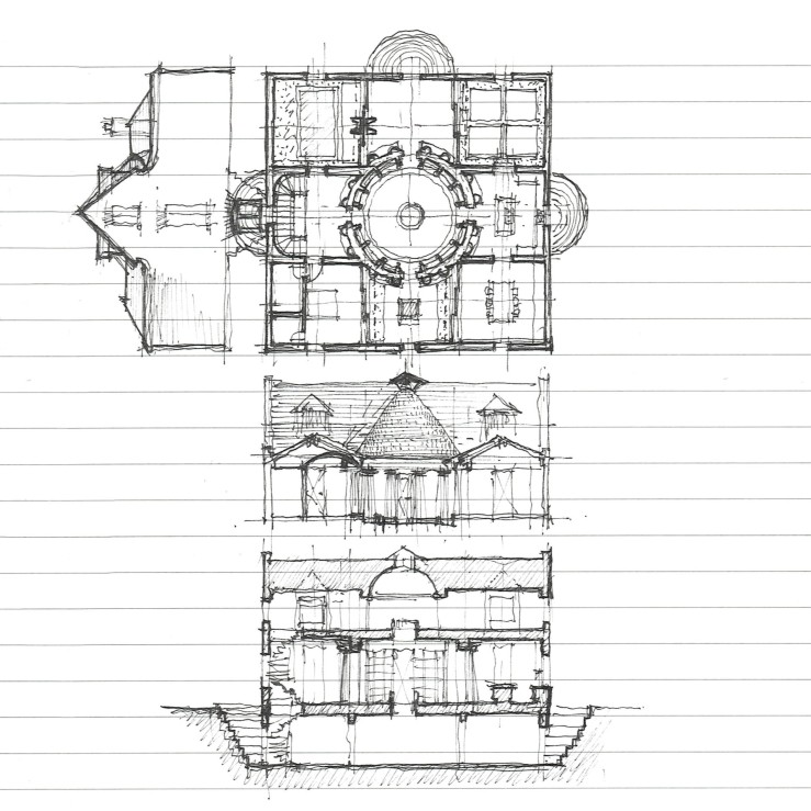

.GIF)