taking a spin with ellwood

ellwood_01

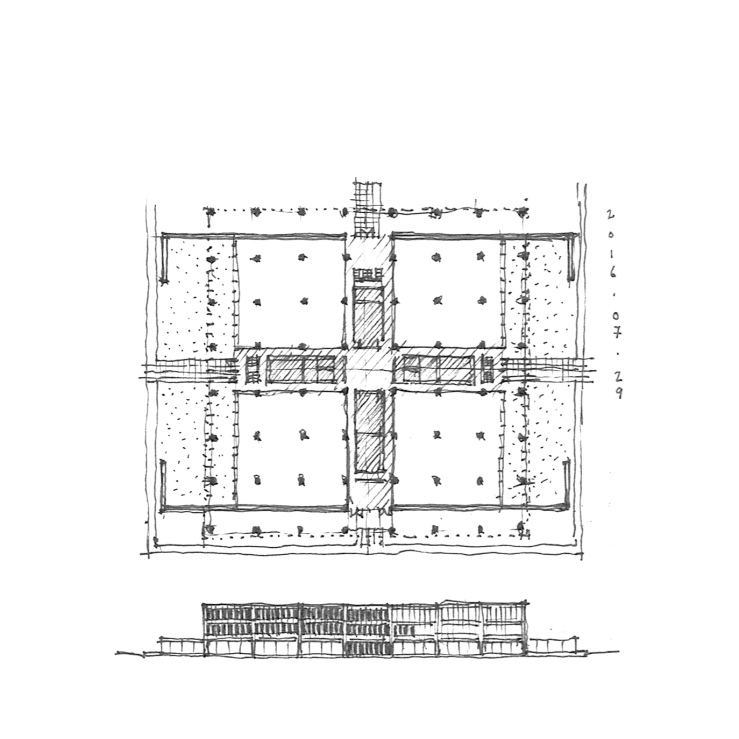
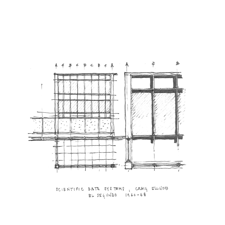
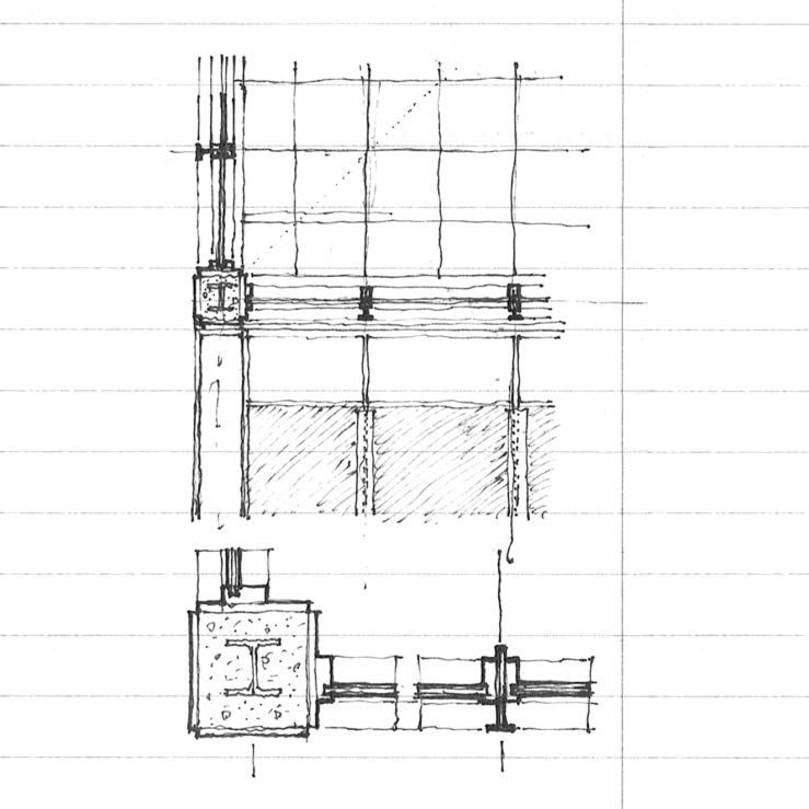
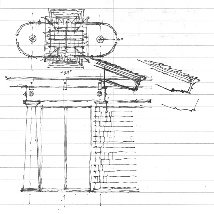
From last Friday’s foray into Craig Ellwood’s Scientific Data Systems building, I offer a revised take, with a large standing seam copper hip roof, and a skylit rotunda in place of the cubic atrium, and rounded out the panelled masonry walls along the east and west axes.  Placing a large hip roof on a square form may be a subtle nod to Thomas Beeby’s Baker Institute at Rice University. The detail at right shows a new cornice with dentils and beads rendered in brick.  Maybe something fun could be done with those columns. . .

ellwood makes a square

ellwood_02

Driving through El Segundo the other week, I ran across a nice Miesian office block.  A quick internet search for the name ‘Xerox’ which was left stained on a concrete wall and I stumbled across an all too familiar name – Craig Ellwood (Originally built for Scientific Data Systems, which was later bought out by Xerox).  A floor plan confirmed my suspicions – a perfect square on 64 columns, raised one floor off the ground with a directional access given by two long walls on the east and west facades, and storefront gazing on the north and south, all centered on a cubic central atrium.  The details are almost perfect derivatives of Mies’, but the vertical window mullions stop at the spandrel panels rather than continue full height as MVDR would have done (see Murphy’s Daley Center compared with Mies’ IBM tower).  The whole project is undergoing a less than inspiring renovation by SOM, with absolutely no heed for the building module and planted ‘green’ walls.  Too bad.

ellwood_03

ellwood_04

language & detail

garden-pavilion_04

Sometimes the drawings I post seem rather schematic, but as part of the great importance of building  in architecture, they can never remain that way.  Here I present you with a more detailed take of a recent post, with hybrid Tuscan-Doric columns (perhaps Graves doing Doric, maybe?), minimal Mies-ian window jambs and stops, shingled wall with a moulded cap to make the column in antis, all topped with a simplified architrave, rosettes replacing triglyphs.  I fancy the wood work might all be painted a glossy black, similar to Earnest Coxhead’s shingled houses in San Francisco (and Bob Stern’s take on them).

aalto revisited

AALTO_03

I had wanted to draw this while we were on site, but the monk who was giving us a tour was moving at a brisk rate.  This is the entrance pavilion to Aalto’s Library at Mount Angel, as previously featured here, and is worth featuring because of the inherent classicism of it all – strictly modular, rigidly symmetrical (minus that one angled wall on the right), with a well-coordinated ceiling plan, brick floor patterning, column placement, and door/storefront alignment.  For the über-modernist Aalto, this is proof that his early education in Nordic Classicism never truly left.  Details below.

AALTO_02

a barn to live in

BARN_02

Taking its form from some barn structures I passed on my trip to Oregon, this house has two opposing axes, one large gable, and a hip-ish roof.  A spiral stair gently curves out on the side opposite the main entry.  Classical details sit happily next to vernacular forms.  Further formal explorations below

BARN_03

BARN_04

a dutch gable folly

GARDEN-PAVILION_01

Part gable, part hip roof: the dutch gable.  This small pavilion is a simple post-and-beam structure, on a four-square plan, with shingled walls set in antis to the columns on two sides, all beneath a large square dutch gable roof.  The roof is inherently directional, always favoring one axis of the other, even though the eaves remain constant.  The bottom drawings attempt to subvert this, making the dutch gable diagonally symmetrical, similar to the roof of a small cabin I featured some weeks past.

GARDEN-PAVILION_02

GARDEN-PAVILION_03

bruce price and dueling chimneys

BRUCE-PRICE_02

Once again, Price regulates the picturesque qualities of the Shingle Style on a strict module and with intense symmetry.  Two chimneys dominate the principal facade, which has a Richardsonian Syrian arch dead center, flanked with expansive glazing and shingled balconies on the sides, which top long portico-ed porches.  The symmetry only breaks at the entry facade, where a small porch sits next to the stair hall.

bruce price @ tuxedo park

BRUCE-PRICE_01

Today I’ll start a short series on four summer cottages located in Tuxedo Park, NY, by Bruce Price, who also designed numerous other buildings in the masterplanned community.  This cottage of 1886 takes the aesthetics of the Shingle Style, but meets them with a rigid modularity and symmetry.  More to come.

two squares, unalike.

BASILICA_07

Juxtapositions: the first square is further development of a project I featured some time ago, where the square is the internal volume (indeed cubic in it’s section), but flanked on two ends with large masonry walls that curve in to the entrances, and again to form corner towers, while opening to full-height glazed opening on the sides.  The second square is a study of differing systems, where the primary axis is four-square, and the secondary is nine-square, all topped with a shallow central dome.

SCHINKEL-MEIER_01