a bridge house

BRIDGE-HOUSE_01

frame is back in town.  So let’s get started: two classical brick pavilions sit under their modernist counterpart, divided by a long driveway, forming a nine-square plan.  While the first story bars quote Bruce Price’s library at Tudedo Park, the second story harps on Johnson’s Glass House in New Canaan.  Details follow.

BRIDGE-HOUSE_03

BRIDGE-HOUSE_02

yet another basilica

KIRCHE_03

O. M. Ungers and Richard Meier play the primary instigators in terms of language of this basilica – minus the Doric impluvium entry courtyard, of course.  The front elevation/plan drawing shows shadows that hint at both wormseye and oblique axonometric projections.  Structure and tectonics play a central role where pipe and wide flange columns slide back and forth next to one another, while small circular side chapels cut into the deep poche of the stone walls.

KIRCHE_04

KIRCHE_01

KIRCHE_02

a marble cube

CUBE_02

This room comes from a very unlikely place – a simply detailed restroom at Richard Meier’s Getty Center.  A heavily veined dark grey marble floor stood in nice contrast to the Carrara marble wainscotting and white plaster walls above.  That’s where things started.  This version panels out the Carrara walls on the interior, topping it off with a tall conic skylight (maybe the Getty galleries?), and all of it wrapped in a Tuscan-detailed wood wrapper.

CUBE_01

a reliquary

RELIQUARY_01

This is not architecture – at least not in the traditional sense – this is a small piece of furniture with architectural referent.  It stems from Michael Graves and his explorations of architectural tropes within product design.  But it asks important questions regarding architectural language, offering the position that the language of building can be adapted and applied to other parts of our lives, even if it be devoid of true tectonic value (see the small ‘windows’ and ‘acroteria’ on the above drawings).

RELIQUARY_02

two squares, unalike.

BASILICA_07

Juxtapositions: the first square is further development of a project I featured some time ago, where the square is the internal volume (indeed cubic in it’s section), but flanked on two ends with large masonry walls that curve in to the entrances, and again to form corner towers, while opening to full-height glazed opening on the sides.  The second square is a study of differing systems, where the primary axis is four-square, and the secondary is nine-square, all topped with a shallow central dome.

SCHINKEL-MEIER_01

putting the pieces together

MUSEUM_01

Lacking any particular program (that is, use), this courtyard structure plays on several ideas: the plan is neither a true double-courtyard, neither is it truly H-shaped (where the courts would be open on one side); one half of the project is more abstract modernist while the other is more expressly traditional; glass walls sit next to Classical colonnades; all the while the two side volumes are topped with that dormer I posted a few weeks back.

a gas station and the california vernacular

GAS-STATION_02

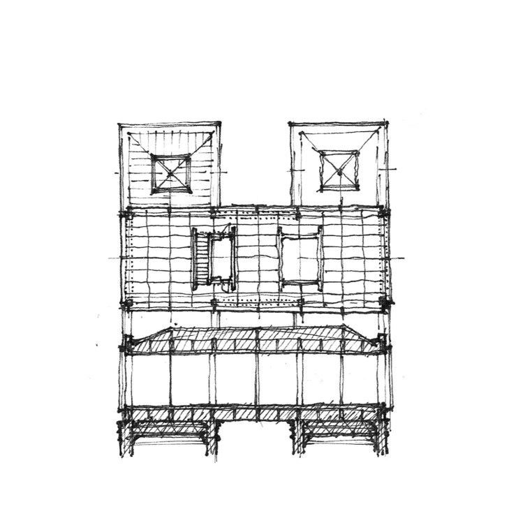
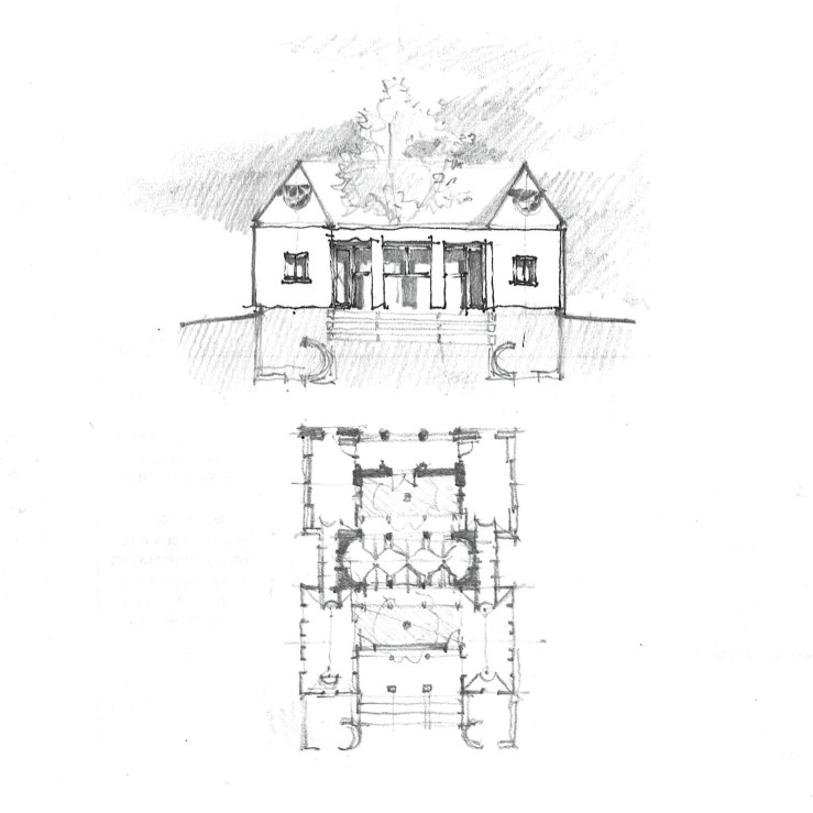
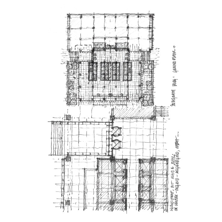
Driving along the coast through Laguna Beach, I noticed a funky little structure now operating as the offices for a small auto repair shop – it was clearly an old gas station, with the concrete pump pads still extant, which I’ve drawn in the top-most drawing.  The fascinating bit was that the overall building was a  gabled Spanish stucco hut, complete with a red tile roof and chimney, but the service awning was a flat modernist roof, and which cut deep into the gabled volume.  The overlap and simultaneity of languages was so simple, irreverent, and playful.  So I did my own variation: the plan is the bottom half of the top drawing, the half-elevations are below.

GAS-STATION_03

from mies to wright

FLW_02

Keeping the Chicago theme, but moving a bit back in time, today I’ll feature some early Frank Lloyd Wright, particularly the Cheney House in nearby Oak Park.  The plan is fascinating because it is an effectively square structure under a large hip roof, divided into two halves: the front is made up of three public rooms (nine square), while the back is broken into four bedrooms (four square), with servant spaces filling out the middle.  The hearth is at the very center of the house, typical Wright.  This basic parti (formal planimetric diagram) still fascinates me to this day – a simple form with a complex, yet brutally clear interior logic.  The variations it inspired will follow over the coming days.

FLW_03