a cabin

CABIN_02

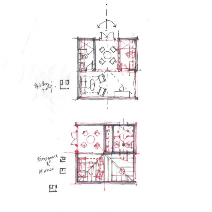
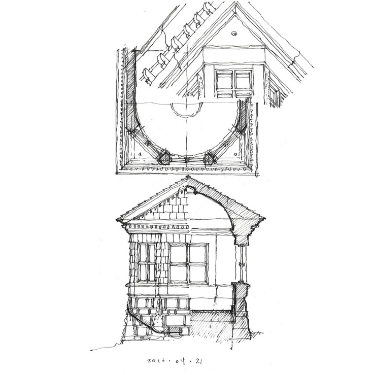
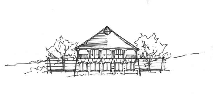
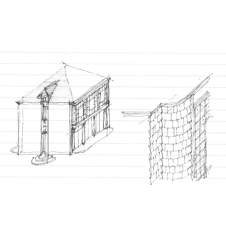
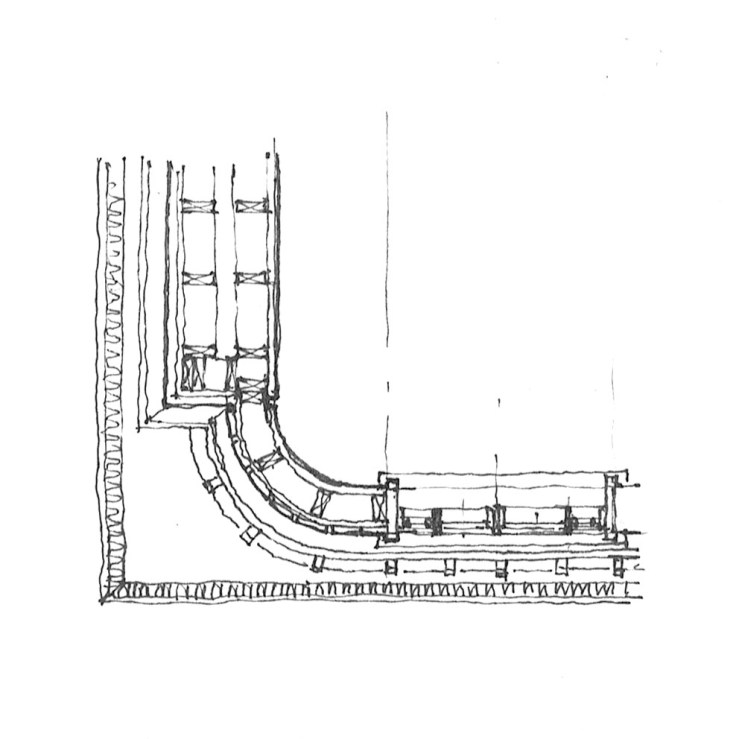
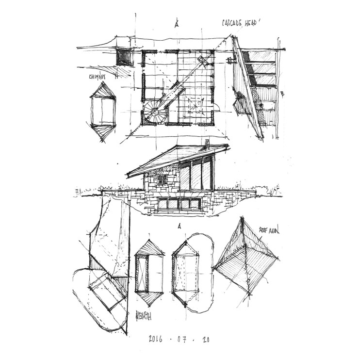
Diagonally symmetrical, this small cabin type is a riff on the minimal, mid-century cabin we spent a week in on the Oregon coast.  The plan is four-square, with the living room occupying one corner, fully glazed, with the hearth as a corner-focused object: this is a direct quote of our cabin, down to the thin-gauge blackened steel hearth.  The rest of the plan stems from this single move, with the circular stair opposite, a study and kitchen flanking.  The roof runs a single gable along the diagonal toward the living room, but tapers back into a typical hip for the two other facades.

graves does portland

GRAVES_04

What would a frame roadtrip be without a little precedent study?  Case 1 – the infamous, amazing, polarizing, kickass Portland Building.  And just to show you that drawing is a learning process, complete with error, the front elevation shown above incorrectly correlates the stepped entrance pavilion and the Portlandia statue it rests on – hence the small partial elevation underneath it.  Below, I highlight a discrepant exterior and interior window in elevation and section as well as interior tile ‘wainscotting’ and an exterior arcade.

GRAVES_03

simply canadian

EMPRESS_01

This post is simple – the building is simple.  This is a small motor pavilion at the Empress Hotel in Victoria, BC.  The neo-gothic style of the main hotel is reinterpreted in a small square glass and iron pavilion.  What I’m showing here is merely there clerestory roof volume with half of a reflected ceiling plan and an elevation.  The copper standing seam roof has aged wonderfully on the salty bay air.

a weekend house

LYCEUM_07

One half is a nine-square (Richardson wrapper, Mies core), while the other half is a four-square (Neutra patios, Mies fireplace).  This came from a small garage conversion that never got off the ground – see bottom drawing.  So here it is.

LYCEUM_06

LYCEUM_03

two squares, unalike.

BASILICA_07

Juxtapositions: the first square is further development of a project I featured some time ago, where the square is the internal volume (indeed cubic in it’s section), but flanked on two ends with large masonry walls that curve in to the entrances, and again to form corner towers, while opening to full-height glazed opening on the sides.  The second square is a study of differing systems, where the primary axis is four-square, and the secondary is nine-square, all topped with a shallow central dome.

SCHINKEL-MEIER_01

a bay window

BAY-WINDOW_01

A bay window topped with a full-width gable, leaving small triangular soffits at the eaves.  I noticed this feature on my way to a site meeting in South Los Angeles, and since then have seen it recurring throughout my library – Richardson, Bruce Price, Peabody & Stearns, et al.  So here’s my version: covered in shingles throughout, battered stone walls at grade, four-square windows, the gable becomes a full pediment, and the big reveal – a rounded interior wall.

a mountain-side courtyard home

COURTYARD-HOUSE_03

This house is a line of three squares: a central tree-filled courtyard flanked by a garage/studio impluvium volume on one end, and a large, hip-roofed residence on the other.  The rafters of this roof extend to encapsulate a long porch, the majority of which is screened.  A spiral staircase descends to the bedrooms, which are located below.  The complex is imagined to be sited on a hillside, with the garage square nearly underground, and the residence looking out over the valley below.

COURTYARD-HOUSE_04

COURTYARD-HOUSE_05

COURTYARD-HOUSE_01


shingles, squares, and circles

HOUSE_03

Let’s start with the detail this time, reading top to bottom: 1.) A shingled wall curves in to meet a stucco wall in a re-entrant corner.  Square windows are cut from this, mullioned into the four-square, with small, beveled squares around.  2.) This shingle wall is the second story with a colonnade below, the stucco is an otherwise blank wall, with only one tall window cutting through the middle and terminating in a dormer at the roof.  3.) This tall window only hints at the circular interior volume behind, one side a stair, the other an entry.  Other than that, no record of the two wall systems is traced on the interior, where only the radius of the curve exists.  4.) And just like that, we’re back at the detail again.

HOUSE_04

HOUSE_05

HOUSE_02

from mies to wright

FLW_02

Keeping the Chicago theme, but moving a bit back in time, today I’ll feature some early Frank Lloyd Wright, particularly the Cheney House in nearby Oak Park.  The plan is fascinating because it is an effectively square structure under a large hip roof, divided into two halves: the front is made up of three public rooms (nine square), while the back is broken into four bedrooms (four square), with servant spaces filling out the middle.  The hearth is at the very center of the house, typical Wright.  This basic parti (formal planimetric diagram) still fascinates me to this day – a simple form with a complex, yet brutally clear interior logic.  The variations it inspired will follow over the coming days.

FLW_03