two squares, many arches

PORTICO-HOUSE_10

It’s been far too long – apologies are in order.

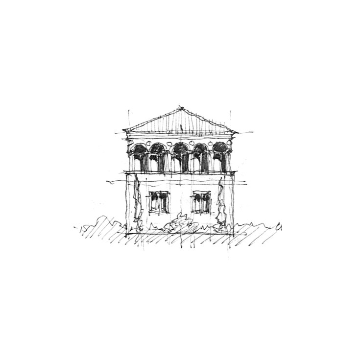
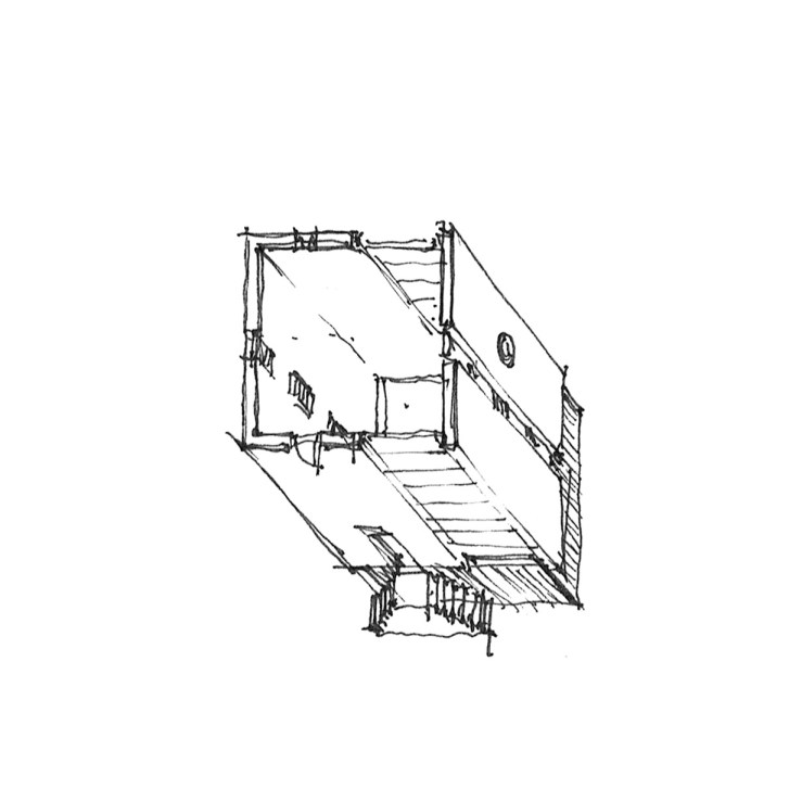
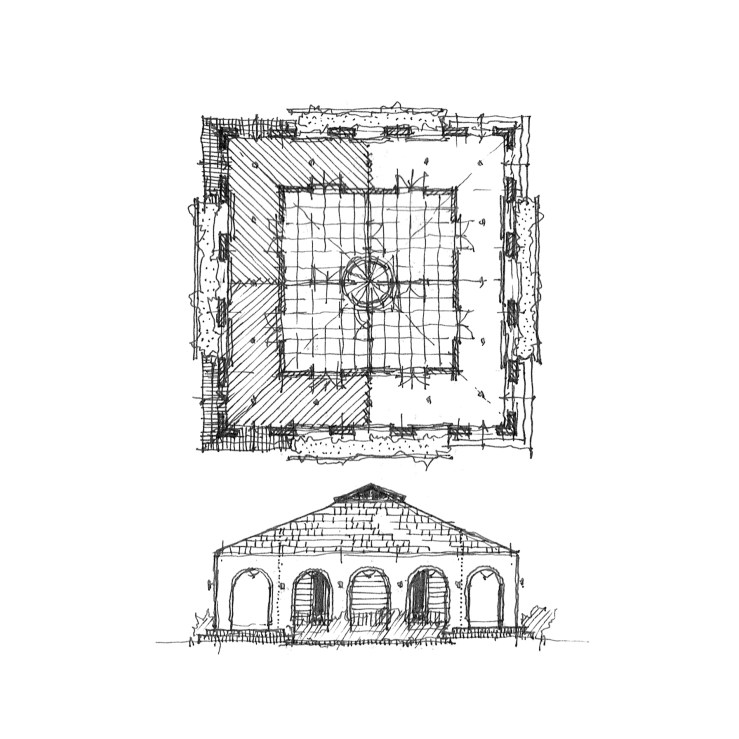
But today it’s back to basics: square and arches.  The first project is a simple study of a simple idea, instigated by an awful homespun diy renovation in my neighborhood, where a series of plaster arches had been tacked up under a shallow roof overhang, obscuring the clapboard home beneath.  I’ve ordered it a bit more, rendered in a square with access via brick steps at the corners – a four square clapboard home sheltered behind a humanist arcade.

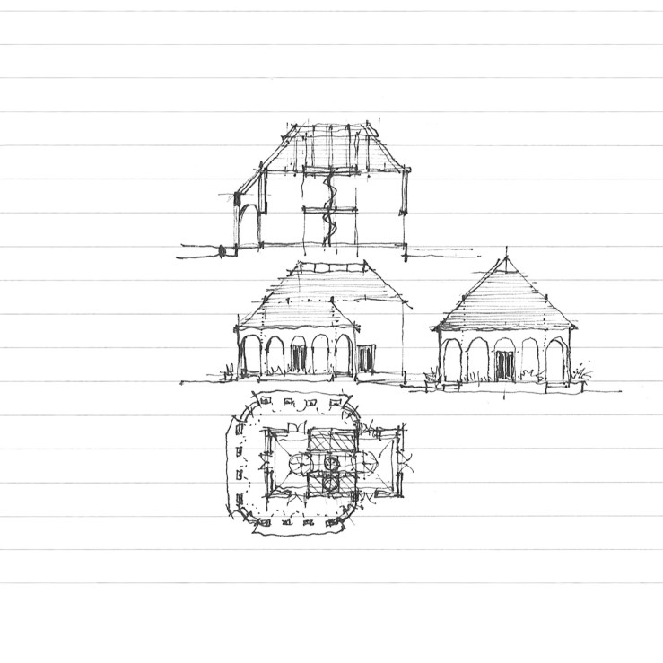
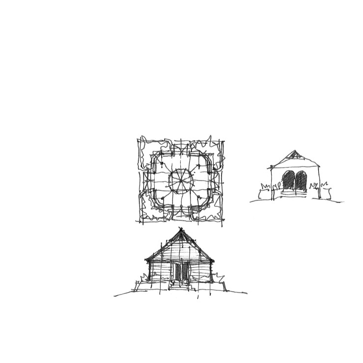
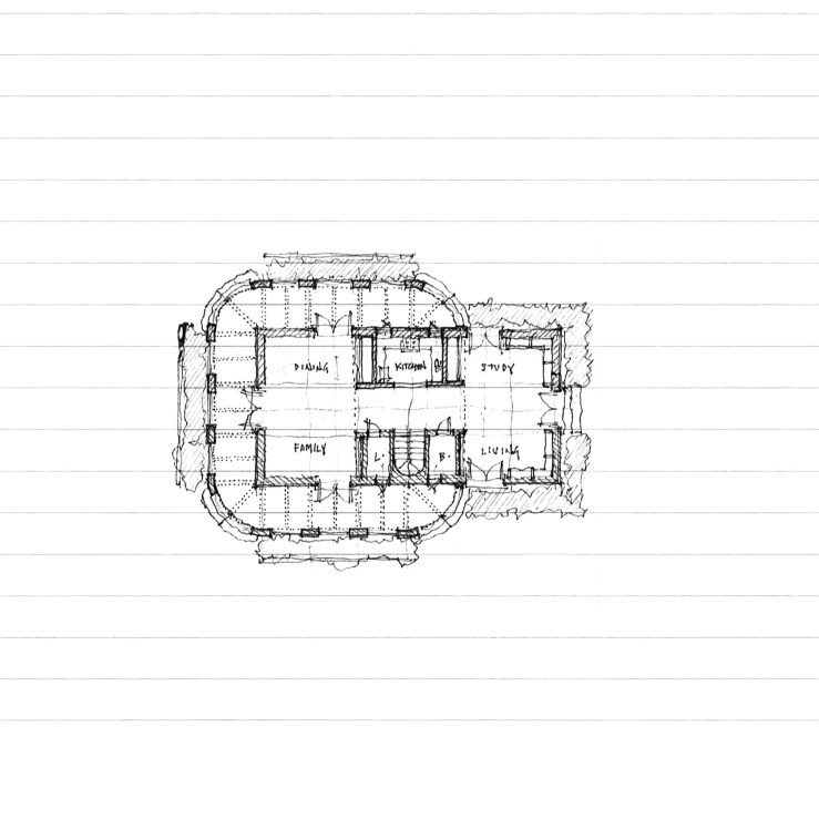
The second project is another simple pavilion, this time with rounded corners and  centralized access.  A quick study to the right explores an arcuated form, with a centralized column instead, harkening back to the four square plan mentioned above.
PAVILION_18

another house. another veranda

PORTICO-HOUSE_06

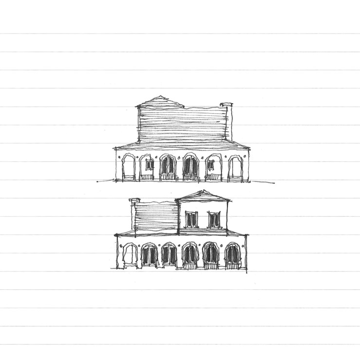
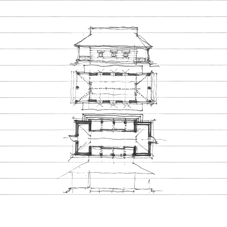
Some time ago, I shared a very Irving-Gill-dependent rectangular home with a wrap-around arcaded veranda.  Today, I’m offering a new take on that plan – taking a cue from the Shingle Style and rounding out the corners of the veranda, and subsuming the whole under a large, steeply pitched hip roof.  Here, the veranda is more closely tied to the rectangular volume behind it, rather than merely acting as a stand-alone wrapper.  Personally, I find both equally interesting, but I’ll let you take your pick.

PORTICO-HOUSE_05

at home with an arcade

PORTICO-HOUSE_08

There’s a single family house in my neighborhood that was at one time wrapped in a deep arcade.  Though rotting and falling apart (and no doubt unpermitted), the regular rhythm of the arches masks the asymmetrically placed windows and doors behind.  I tied this with Irving Gill’s Oceanside City Hall of 1934 (also here), which uses an arcade in a similar fashion, to regularize an otherwise syncopated facade.

Today’s project takes Gill’s more refined use of the arcade and applies it to the single family home, a typical, asymmetrical, single story, home not unlike many here in Southern California (and indeed in many suburban neighborhoods).  This results in some interesting conditions, with some occupied spaces pushed right up behind the arcade while leaving shallow porches elsewhere, and even enclosing a small garden within its bounds.

The options below take the same floor plan of above, but add a second floor, positioning the arcade proper against taller volumes behind.

PORTICO-HOUSE_07

PORTICO-HOUSE_09

L’s and porches

DIAGONAL-HOUSE_01

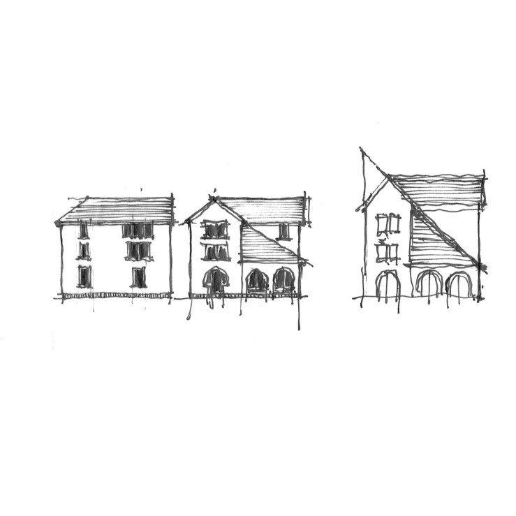
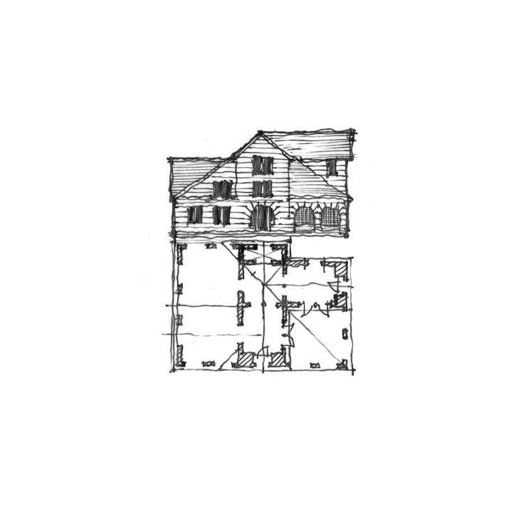
This small house takes its initial generation from a small, L-shaped home I drove past while on vacation in Oregon this past spring, where a porch filled out the square floor plan, its tall hip roof hitting the crotch of the two-story behind.  My version envisions a three-story volume to heighten the drama of the hip roof over the porch, with a circular stair at the corner of the L, while large Richardsonian Syrian arches front each gabled end, here rendered with a Gill-inspired symplicity.  I also toyed with adding a wing outside the L, after seeing a photo of a similarly planned house which featured a few wing additions – in this parti, the L is subsumed into an overall symmetry.

DIAGONAL-HOUSE_02

DIAGONAL-HOUSE_03

DIAGONAL-HOUSE_04

sets, bricks, jacks, and squares

SET_02

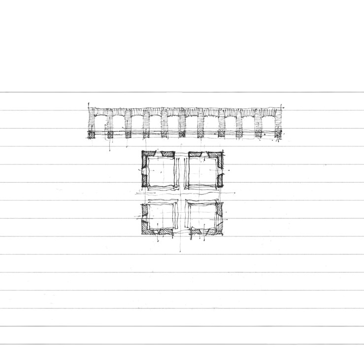
From Donald Judd and the architecture of art last week, I bring another tangentially architectural enterprise today: set design.  This work came about through viewing terribly underwhelming sets at the local opera.  My thoughts began to race about how the story could have been more magnificently communicated through architectural form rather than a few gauzy curtains.  This version positions a continuous brick jack arcade along the entire upstage, with four brick ‘el’s that could move about in the foreground, turning towards the audience for an ‘interior’ perspective, or away for the ‘exterior’, or alternated in-and-out, aligned into two open ‘rooms’, or one closed off cube.  Allusions to the work of Edward Gordon Craig, Adolphe Appia, and Richard Peduzzi abound.

SET_01

a house of opposites

CHECKERS_02

This is a simple, ‘shotgun’ home, with two porches flanking either side, and a large central room in the middle, accentuated by the ‘dutch’ gable of the roof.  The ‘opposites’ so named in the post’s title indicate that the ground floor has open porches on the ends with a solid middle, while the semi-enclosed basement has the opposite: enclosed ends and an arcaded middle.  This came about through a simple drawing, shown above, where the same parti  could easily be rendered in either formation – so why not do both?  That hybrid elevation is below, where the opposition of the two systems results in a ‘checkerboard’ pattern, not too dissimilar from Lutyens’ own, larger, experiments.

CHECKERS_01

three squares

PALAZZO_01

Three sketches, three squares, in anticipation for my 3X10 birthday tomorrow (the 3rd).

The first, an elevation, with an arcade atop two square windows in a wall – Traditional form with abstraction below.

DIAGONAL_01

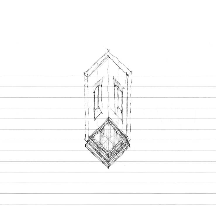
The second, a plan, square in form, but diagonal in organization, with a nice entry rotunda on the corner.  This is an homage to Schindler’s diagonal square plans (the How House and Bethlehem Baptist Church, plan), and his mentor’s detailing at the Ennis Brown House.

CUBE_03

The third, in a three-dimensional axonometric, a modernist cube.

lutyens and an arcade

lutyens_01

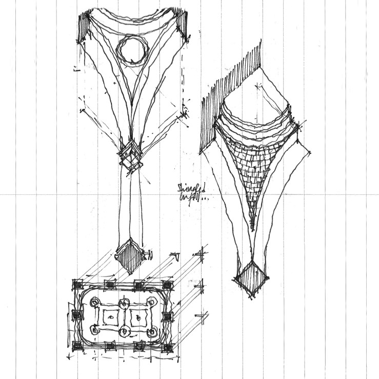
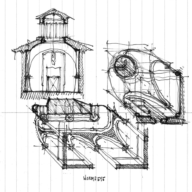
Returning to the work of Lutyens, this small room takes its primary cue from a detail in a stair hall at Viceroy’s House, New Delhi, where an arcade is topped with a small pendentive at the corner, curving the profile of the ceiling.  Wormseye axonometric views follow – the bottom image also has sectional and wormseye studies of another Lutyens-inspired previous post.

lutyens_02

lutyens_03

graves does portland

GRAVES_04

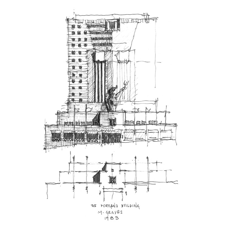
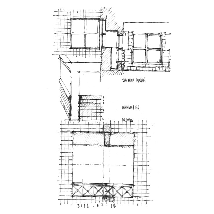
What would a frame roadtrip be without a little precedent study?  Case 1 – the infamous, amazing, polarizing, kickass Portland Building.  And just to show you that drawing is a learning process, complete with error, the front elevation shown above incorrectly correlates the stepped entrance pavilion and the Portlandia statue it rests on – hence the small partial elevation underneath it.  Below, I highlight a discrepant exterior and interior window in elevation and section as well as interior tile ‘wainscotting’ and an exterior arcade.

GRAVES_03