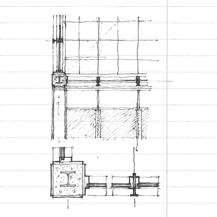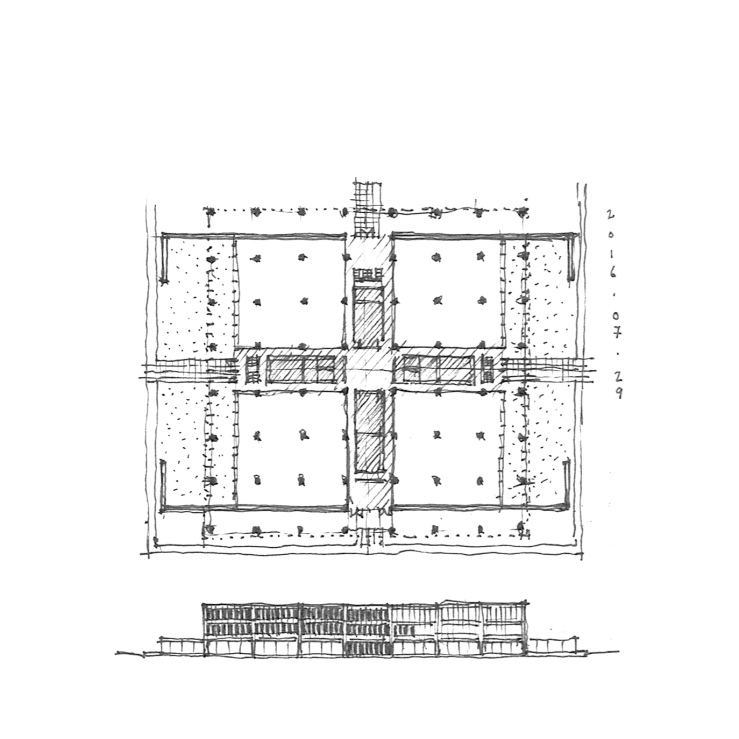
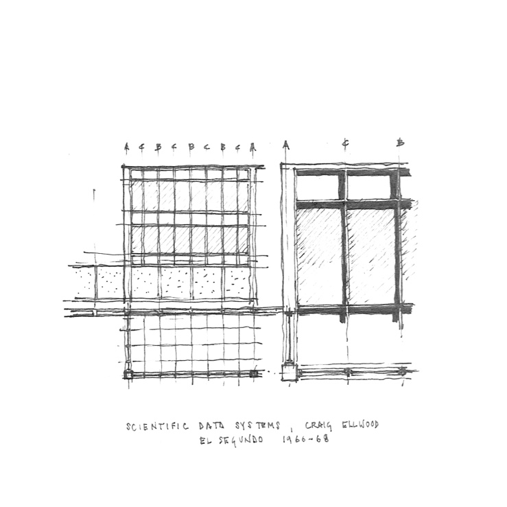
Driving through El Segundo the other week, I ran across a nice Miesian office block. A quick internet search for the name ‘Xerox’ which was left stained on a concrete wall and I stumbled across an all too familiar name – Craig Ellwood (Originally built for Scientific Data Systems, which was later bought out by Xerox). A floor plan confirmed my suspicions – a perfect square on 64 columns, raised one floor off the ground with a directional access given by two long walls on the east and west facades, and storefront gazing on the north and south, all centered on a cubic central atrium. The details are almost perfect derivatives of Mies’, but the vertical window mullions stop at the spandrel panels rather than continue full height as MVDR would have done (see Murphy’s Daley Center compared with Mies’ IBM tower). The whole project is undergoing a less than inspiring renovation by SOM, with absolutely no heed for the building module and planted ‘green’ walls. Too bad.
Category: precedent
aalto revisited
I had wanted to draw this while we were on site, but the monk who was giving us a tour was moving at a brisk rate. This is the entrance pavilion to Aalto’s Library at Mount Angel, as previously featured here, and is worth featuring because of the inherent classicism of it all – strictly modular, rigidly symmetrical (minus that one angled wall on the right), with a well-coordinated ceiling plan, brick floor patterning, column placement, and door/storefront alignment. For the über-modernist Aalto, this is proof that his early education in Nordic Classicism never truly left. Details below.
elevations
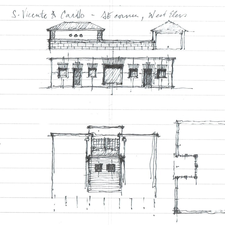
Three buildings I saw while driving cross town = three quick elevation studies: A symmetrical hip-roofed house with a long continuous masonry wall that continues to form a low wall on the rear yard; A series of openings on a flat stucco wall, centered on one large square picture window (the jack arches are my own); A square light well lined with industrial sash windows, and a clapboard volume beneath.
karelia in oregon
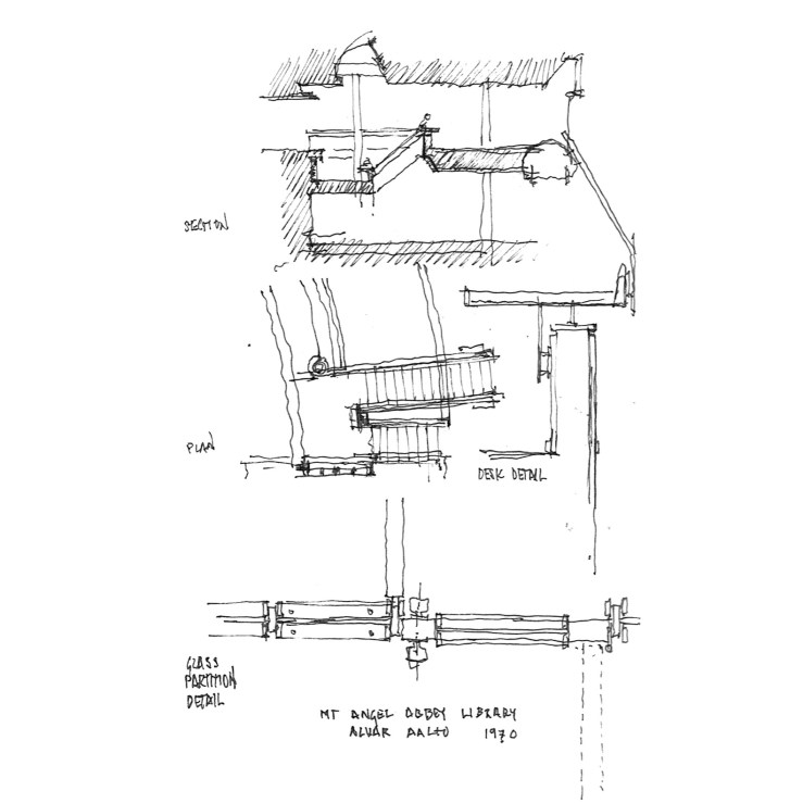
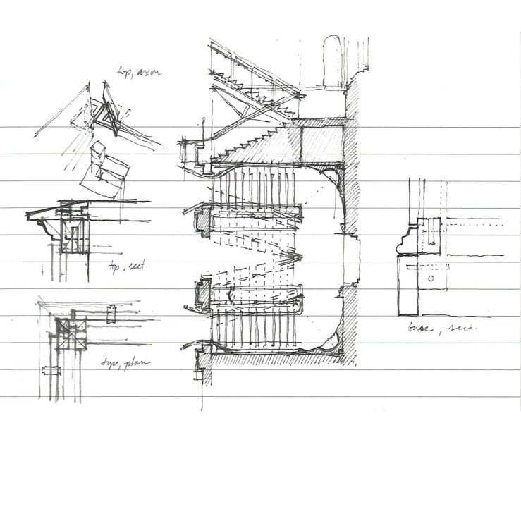
Alvar Aalto has only three built structures in the United States: a dormitory at MIT, an interior on Manhattan, and a library at a Benedictine Abbey in Mount Angel, Oregon. These few drawings are my rapid attempt to distill some important moments from the Abbey library, which I visited on a recent trip up the Pacific coast: A section through the skylit split-level reading room, and a plan beneath; a detail section through a typical study desk, which run the length of the double-height spaces, eliminating a traditional guardrail; and a detailed plan of a glass partition at independent study carrels, with hollow-steel-section framing members and wood stops – a beautiful, humane, change to the typical Miesian system. There was so much more, but unfortunately so little time.
an oregonian lighthouse
My wife and I drove the coast on our way back home from Portland, and we stumbled upon an lighthouse along the Coquille river in southern Oregon. I was struck by the simple forms rendered in white plaster: the tall cylindrical light and a low lozenge-shaped accessory building. These were both detailed in a pseudo-French collection of mannered profiles and mouldings, with large cyma-ed keystones and segmental arches, and iron king-rod trussed roof construction. Civic work today pales in comparison.
graves does portland
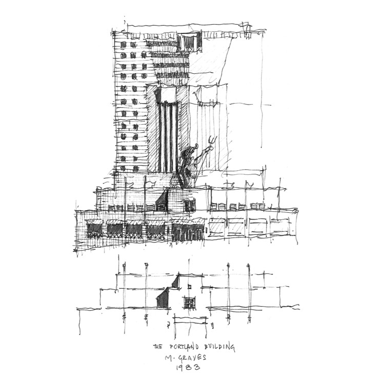
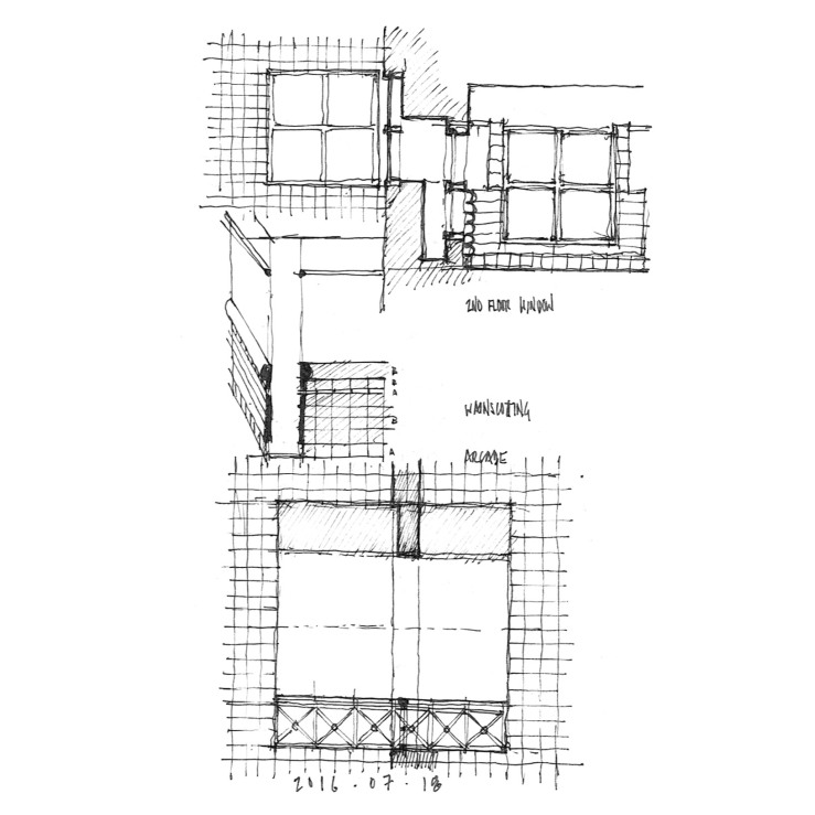
What would a frame roadtrip be without a little precedent study? Case 1 – the infamous, amazing, polarizing, kickass Portland Building. And just to show you that drawing is a learning process, complete with error, the front elevation shown above incorrectly correlates the stepped entrance pavilion and the Portlandia statue it rests on – hence the small partial elevation underneath it. Below, I highlight a discrepant exterior and interior window in elevation and section as well as interior tile ‘wainscotting’ and an exterior arcade.
tales from the getty villa
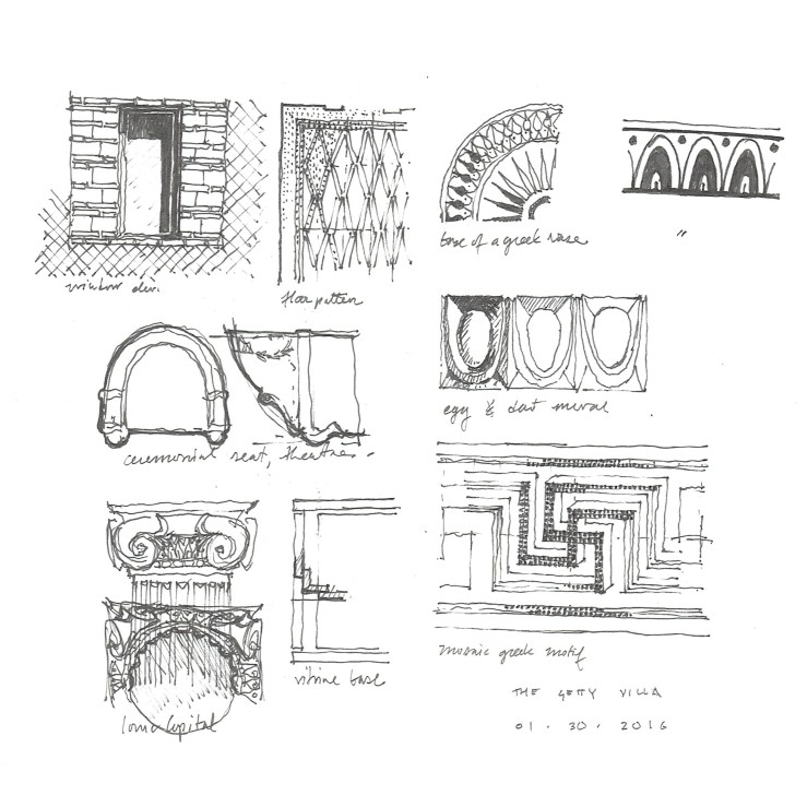
My wife and I took a short trip to Machado Silvetti’s Getty Villa a few months ago. I brought along my sketchbook and put down a few details, ideas, or forms that I found fascinating – from the archaeological ‘Roman’ architecture of the Villa proper, Machado Silvetti’s modernist interventions, or the ancient Roman and Greek antiquities housed inside, including that splendid bronze staircase (underside of risers and stone handrail).
simply canadian
This post is simple – the building is simple. This is a small motor pavilion at the Empress Hotel in Victoria, BC. The neo-gothic style of the main hotel is reinterpreted in a small square glass and iron pavilion. What I’m showing here is merely there clerestory roof volume with half of a reflected ceiling plan and an elevation. The copper standing seam roof has aged wonderfully on the salty bay air.
bruce price goes diagonal
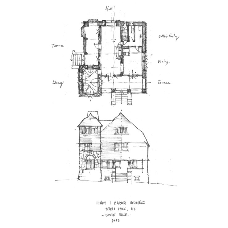
In a seeming break with the previous two Price projects that were relentlessly symmetrical and modular. This project would seem to diverge – seem to. The reality is that this cottage is just as systematic as the previous two, but its symmetry is diagonal rather than axial, and its modularity is only shifted one half bay to turn a regular square plan into a rectangular one. The ground floor is all ashlar cut stone, while shingles cover nearly everything else. A large tower takes up one corner, where the ashlar rises up into the second story, even to the third at a small circular corner column – see wormseye axonometric below. Rounded corners abound – a continuous wrapping surface of shingles consumes the rigid geometry.
bruce price and dueling chimneys
Once again, Price regulates the picturesque qualities of the Shingle Style on a strict module and with intense symmetry. Two chimneys dominate the principal facade, which has a Richardsonian Syrian arch dead center, flanked with expansive glazing and shingled balconies on the sides, which top long portico-ed porches. The symmetry only breaks at the entry facade, where a small porch sits next to the stair hall.